“History must repeat itself because we pay such little attention to it the first time.”
—William “Blackie” Sherrod, American journalist, sportswriter, for a number of newspapers over a 60+ year career, colour analyst for Dallas Cowboys broadcasts; 1919–2016
“Leadership is the ability to hide your panic from others.”
—Lao Tzu aka Laozi, semi-legendary ancient Taoist philosopher, Shaolin monk, translates as “Old Master”, considered founder of philosophical and religious Taoism; 6th century BCE–5th century BCE
“Experience is helpful, but it is judgment that matters.”
—General Colin Powell, American politician, statesman, diplomat, United States National Security Advisor 1987–1989, Chairman Joint Chief of Staff 1989-1993, Secretary of State 2001–2005; 1937–2021
Does history repeat itself? Maybe repeat isn’t quite the word. Maybe it’s more that history doesn’t repeat, but it does rhyme. Take our latest banking crisis. A banking crisis is not unusual. We have, as they say, been here before. The last time was the 2008 financial crisis. Sovereign debt crisis is not unusual, either. We had our last one during the EU/Greek debt crisis that unfolded in 2009 and lasted in various forms until about 2018. It also included others and the acronym PIIGS was born. PIIGS stood for Portugal, Ireland, Italy, Greece, and Spain. All had huge debt to GDP ratios that threatened not just those countries but also the EU.
Debt. It’s wonderful when everything is going up. But it’s a disaster waiting to happen when the tide turns against it. Accumulation of debt in good times makes everything look better. Governments can boost GDP, corporations can boost the bottom line, providing more for shareholders, and consumers can buy a bigger house. And it was all encouraged with record-low interest rates, easy credit, and massive injections of liquidity through quantitative easing (QE). Accumulation of debt makes everything look rosier. As long as prices keep rising. But when prices turn down, everyone forgets they are now leveraged to the hilt. And what goes up fast comes down even faster.
The history of debt and banking crises can fill a book. Or several books. The most famous one we read was by economists Carmen M. Reinhart and Kenneth S. Rogoff: This Time Is Different; Eight Centuries of Financial Folly. There are many others. But the reality is they never seem to learn. They do it over and over and over yet again. Since the world was taken off the gold standard in August 1971 by former president Richard Nixon, we have seen upwards of 30 banking crises. Not every banking crisis resulted in a recession. But the response to each and every banking crisis was largely the same—cut interest rates and dole out oodles of money to save the world from the next Great Depression. Let’s call it depression delayed.
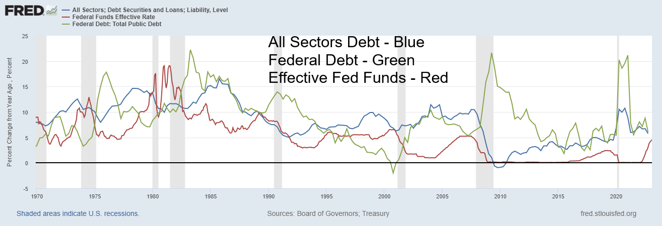
Our chart shows how all U.S. debt and the U.S. federal debt changed percentage-wise year-over-year (y-o-y) vs. the effective fed funds rate. Debt surged as the fed funds rate fell. Since August 1971, U.S. debt for all sectors has surged almost $93 trillion, while U.S. federal debt is up $31 trillion. GDP up? Yes, but not so much. It’s up only $25 trillion. What that implies is that it took $3.70 of new debt to purchase $1 of GDP. Almost all of the debt ever created in history has occurred since 1971. The end of the gold standard signaled a massive increase in debt as money no longer was tied to anything tangible like gold. With the shackles off, debt exploded. Money was now a fiat currency, meaning money is whatever the government has decided it could be. It was no longer convertible to gold (or anything else for that matter). Instead, money is just one big government IOU.
All Sectors Debt and Federal Debt - % Change Year-Over-Year
Effective Fed Funds
Source: www.stlouisfed.org
In August 1971, the U.S. dollar was convertible into gold at the rate of $35/ounce. At the time, money supply (M1) was roughly 20 times the size of the U.S. gold holdings. Strangely enough, the U.S. still carries its gold reserves—8,133.5 metric tonnes, the highest in the world, at $42.22. Today U.S. M1 is almost 1,800 times larger with the U.S. holding the price of gold on its books at an old artificial price. Even using $2,000/ounce, M1 money supply is 36 times the size of U.S. gold holdings. To get it to 20 times where it was in August 1971, the price of gold would have to rise to at least $3,700/ounce. Some are calling for it to be a lot higher. But the reality remains. The end of the gold standard and the dawn of the era of fiat currencies unleashed a debt binge never seen before in history.
Since 1971, we have witnessed a series of financial crises. Bank failures have been a part of that. Silicon Valley Bank and Signature Bank are just the latest to fail. A total of 465 banks in the U.S. failed during the 2008 financial crisis, led by Washington Mutual. Before that, the most famous bank failure in the U.S. was Continental Illinois in 1984. The late 1980s and early 1990s saw over 1,000 failures during the Savings & Loan (S&L) crisis, but most of them were small. The 2008 financial crisis was global in nature and besides bank failures in the U.S. there were was a major financial crisis in the U.K. (Royal Bank of Scotland and Northern
Rock being the most famous failures). There were also financial crises in Belgium, Iceland, Greece, Russia, Ukraine, Spain, and Ireland. All banks suffered, even Canadian banks, but their suffering was limited to loan losses. Irrespective the Bank of Canada (BofC) was doling out funds (QE) to keep the Canadian banks afloat. The only thing Canada didn’t do was lower interest rates to zero unlike the U.S. and below zero (negative interest rates) as did the EU and Japan.
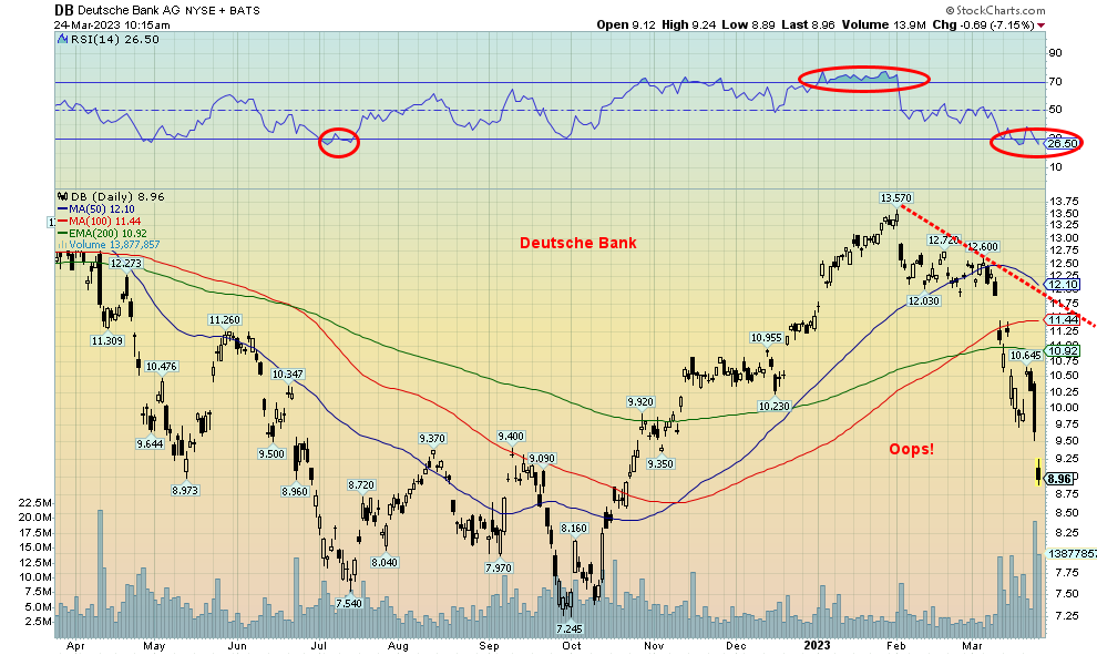
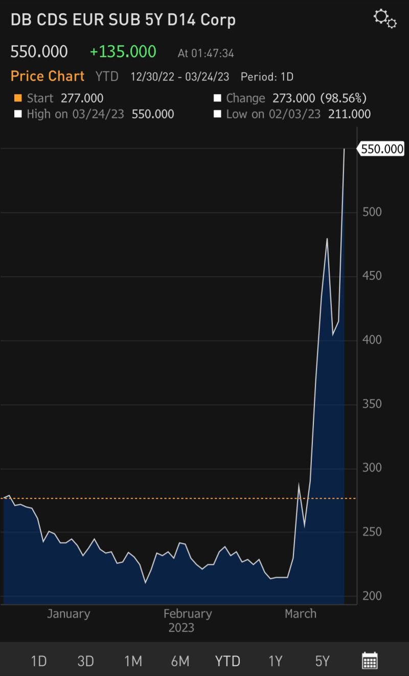
It seems that financial crises are almost the norm ever since we came off the gold standard and debt exploded. However, we’d be remiss in not noting that bank failures and financial and currency crises are not new. Some even date back to ancient times. The collapse of the previously unknown Silicon Valley Bank (SVB) may have unleashed our next banking crisis. Now we are hearing all sorts of stories about Deutsche Bank (DB) being the next domino to fall. The DB story has been around for some time. However, DB like Credit Suisse (CS) is in the category of too big to fail. A bailout, no doubt, will be arranged. It’s no surprise that the cost to insure European banks surged.
Source: www.stockcharts.com
It came as no surprise that the Fed hiked interest rates on March 22 by 25 bp as was widely expected. But is the pause coming? The Fed indicated there could be at least one more hike. The next FOMC is May 2–3. But others hiked rates as well. The European Central Bank (ECB) hiked 50 bp on Thursday and the Bank of England (BOE) followed with a 25 bp hike as well. Only Canada earlier paused.
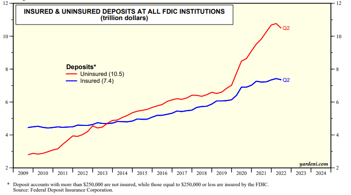
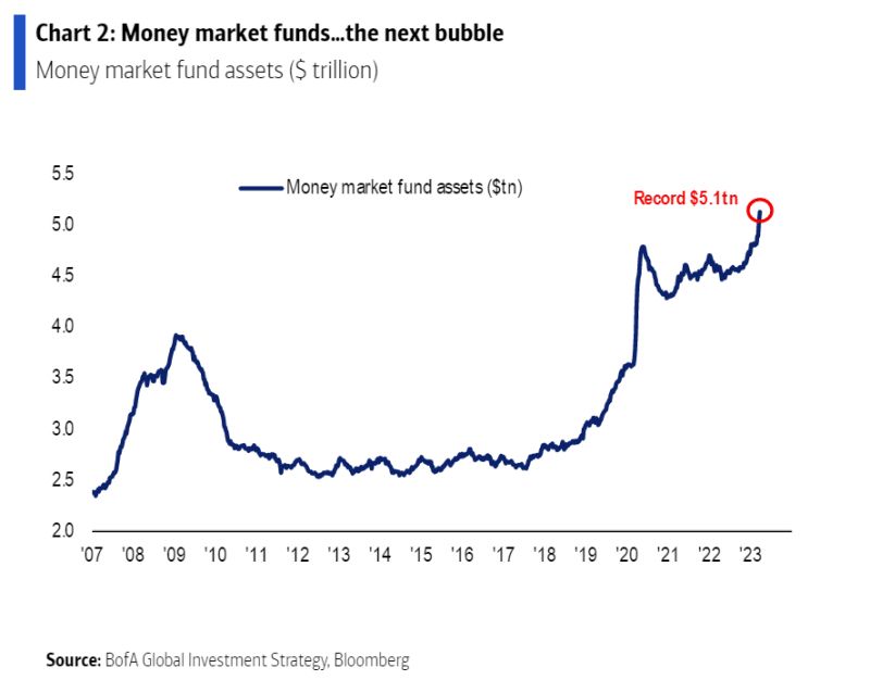
Despite all the banking woes, the name of the game that we are seeing is somehow depositors must be protected at all costs. So, are we witnessing another Fed put? Don’t worry, folks. No matter how much money you have with that failed bank, we’ll protect you. Seems that Federal Deposit Insurance Corporation (FDIC) insurance just leaped from $250,000 to unlimited. Still, that hasn’t stopped many from pulling their deposits and moving the funds to so-called safer banks. Money market funds have also surged. There is an estimated $10.5 trillion in uninsured deposits in the U.S. vs. only $7.4 trillion in insured deposits. The question is, where will the Fed (and other central banks) get the money to bail out everyone? FDIC won’t cover everyone.
Cost to Insure Against European Bank Defaults
Deutsche Bank CDS Euro Sub Debt 5-year Surged
Source: www.bloomberg.com, courtesy of James Wong Portfolio Manager, Hong Kong
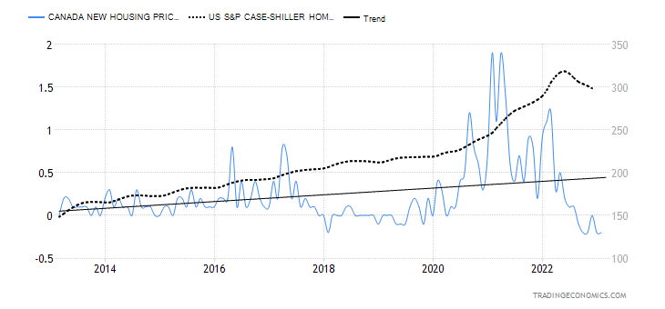
A banking crisis of some proportion is not the only thing that is of concern. Individual consumers are up to their eyeballs in debt. Canada’s household debt to GDP at 103% is the fourth highest in the world. Ahead of them? Switzerland, Australia, and South Korea. Household debt is a big problem everywhere, especially for those who have maxed out their credit cards or have taken out large mortgages that are coming due at sharply higher interest rates. No surprise that defaults and power of sales are both rising, even as housing prices have fallen.
Commercial real estate is also in trouble. The trend of working from home has left behind a lot of half-empty office towers. Liquidity is drying up in the sector, particularly as the banking sector wobbles. In the U.S., some $17 billion is due for renewal in 2023. Apparently, even some large real estate holders such as Blackstone, Brookfield, and Pimco have handed over the keys to some buildings. The amount doesn’t seem large, but it has a direct impact on taxes for cities. It all feeds on itself.
Source: www.fdic.gov, www.mauldineconomics.com
Money Market Funds Have Leaped
Source: www.bloomberg.com, www.business.bofa.com
Canada New House Price m-o-m change, U.S. Case Shiller Home Price Index
Source: www.tradingeconomics.com, www.statcan.gc.ca, www.spglobal.com
What all this is going to do is spark a credit crunch as banks tighten lending guidelines. The last thing banks want is to get caught out with a lot of bad loans. Loans are not only harder to get but also more costly. That in turn puts a damper on purchasing big ticket items such houses, cars, etc. Even travel could suffer.
We could say banks do it to themselves by lending long and borrowing short. When the yield curve is positive/normal, lending long and borrowing short is an acceptable normal strategy. But when interest rates rise and the yield curve inverts, and suddenly you are financing all that long lending (or just buying long-dated assets), the bank finds itself in trouble. You are financing at a big loss and the market value of long assets (bonds, etc.) has fallen in price. The financial institutions have funded themselves with short funds, here today, gone tomorrow money—aka deposits. As nervous depositors flee, the bank or others refuse to lend to them, the bank can’t sell long-dated loans (they could call them in), and the liquid assets such as bonds can only be sold at a loss. Other banks, (all banks?) have much the same problem. How they manage the interest rate yield curve risk varies from bank to bank. Some are active managers and others have never experienced this before and do little. That describes SVB in a nutshell. Are there others? Probably yes.
Governments and central banks only have limited maneuverability. As we call it, they’re between the rock and the hard place. They can’t bail out everyone if a serious banking crisis arises. Years of financial and banking crises have taken their toll. Each financial crisis and recession since the world came off the gold standard in 1971 has been increasingly worse. You never recover from the previous crisis and then the next one comes to the fore. The dates resonate: 1969–1970, 1973–1975, 1980–1982, 1987, 1990–1992, 1997-1998, 2000–2002, 2007–2009 and now today. Suddenly, your ability to deal with the crisis is compromised. That’s where we sit now.
There is another time bomb also sitting out there due to go off at any time. A sovereign debt crisis. There are a number of countries that have been in trouble for years, particularly since the financial crisis of 2008. External
debt is in the trillions and rising interest payments on the debt are putting a number of countries in an untenable situation. They can’t pay. Especially if the loans are in U.S. dollars while their revenues were in a sinking local currency (currency crisis). At the end of 2021, external debt of low and middle economies was some $9 trillion. It’s probably higher now. And it is not just Western banks that would be impacted as China has been a major lender to many low- and middle-income countries. Countries like China, India, Saudi Arabia, and the UAE are not Paris Club members. The Paris Club is the G7 plus a number of other Western economies that, oddly, includes Russia. The Paris Club dealt with many previous sovereign debt restructurings. But how will China, etc. deal with it? Restructuring is made difficult by the fact that the loans are a mixture of public and private loans. Many just can’t pay, period. A prime example of that is Ukraine, while they are embroiled in a war.
The countries most vulnerable to default include Argentina, Egypt, Ghana, Pakistan, Kenya, Venezuela, Lebanon, Nigeria, Russia (who already defaulted or, should we say, were put into default by the U.S.), Tunisia, Sri Lanka, and Ukraine. Call it the “Dirty Dozen.” Many of them besides Russia are already in default.
But the West shouldn’t be so complacent as a number of key countries already have federal government debt to GDP in excess of 100%. They include the U.S., Italy, Greece, Portugal, and Japan. Italy, Greece, and Portugal were at the center of the earlier EU debt crisis in 2009–2018 and a part of the PIIGS.
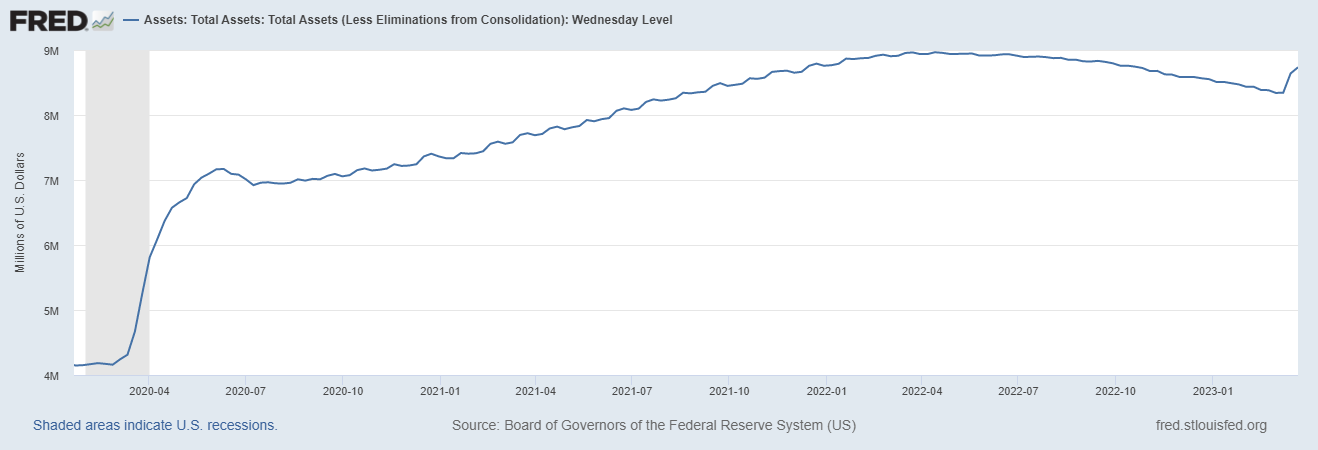
Federal Reserve Balance Sheet 2020–2023
Source: www.stlouisfed.org
The Fed balance sheet is growing again after shrinking for many months. It currently stands at $8.7 trillion. It peaked out just below $9 trillion before the Fed started its quantitative tightening (QT) and rolling off its holdings. Now it is adding back. QE again? Maybe they are not calling it that, but it does have the look of QE. They are also announcing that a pause is coming with their call for one more hike. But, as we say, the Fed (and other central banks) are caught between a rock and a hard place. As the banking crisis deepens, consumers and corporates wobble, and sovereigns tip over, the central banks have a big, big problem. And all this against still high inflation, a war that has no end, and growing negative impacts from climate change such as severe droughts, floods, and storms that have contributed significantly to inflation.
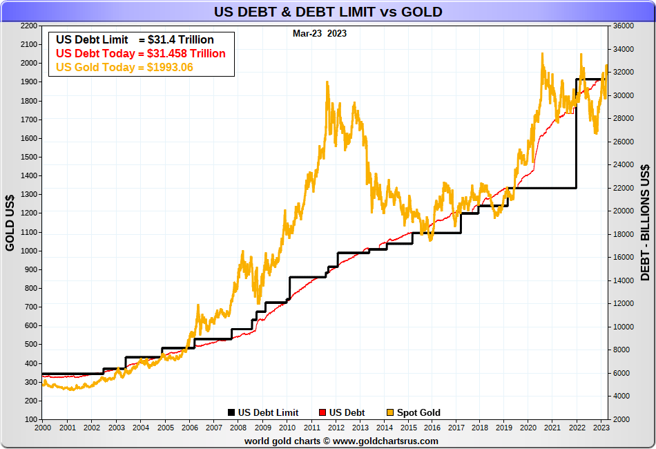
A reminder that gold loves a financial crisis. During the 2008 financial crisis, gold rose from a low of $681 in October 2008 at the height of the Lehman Brothers collapse and peaked at $1,923 in September 2011. We are having another financial crisis, one that is most likely just getting underway. Gold’s low thus far was $1,618 seen in November 2022 (could that be our key 7.83-year and 23.5-year cycle low?). A comparable move today by gold as seen in 2008–2011 could take gold to $4,500. The huge potential cup and handle that has formed on gold over the past decade or so potentially targets to at least $3,100. We have a growing debt crisis and the U.S. needs to raise its debt limit, and soon. But Republicans are holding out as they did before and it was during the last debt limit fight that gold also rose. The downside? As long as gold holds above $1,875 on any pullback, we should rise further once past $2,000. Things might look dire, but for those holding gold they may be able to keep their heads above water.
Source: www.goldchartsrus.com
Chart of the Week
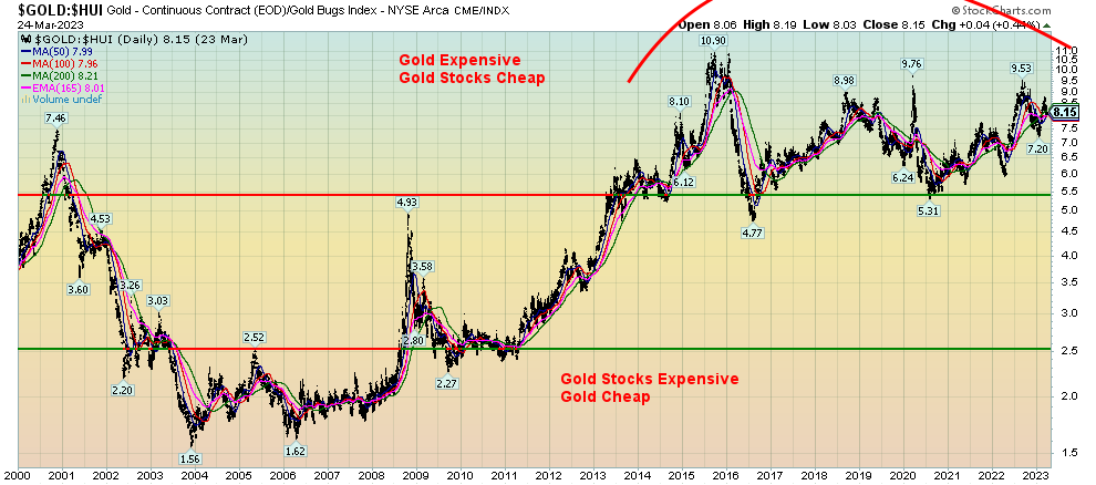
Gold/HUI Ratio
Source: www.stockcharts.com
Gold stocks are cheap. They’ve been cheap for years. This is our technical look at how cheap they are. Speak to mining analysts and people involved in the business, and they will also go on about how cheap they are. Many junior miners in particular are trading below the value of what they have in the ground. Some are even trading for less than the cash they hold. But the producers—junior, intermediate, and senior—are also trading cheap. Our chart of the Gold/HUI ratio shows that (HUI – ARCA Gold Bugs Index).
The ratio has remained high since 2013. Recall that 2013 was the year that saw gold plunge in a massive wipe-out on April 12–15, plummeting over $200 or 13.3% over the two days. But the HUI did slightly worse, losing 14.9%. Recall that gold stocks topped in August/September 2011. By the time the dust cleared in December 2015, gold had fallen $879 or 54% but the HUI fell 84%. Gold was slaughtered, but the gold stocks were annihilated. They’ve never really recovered, despite a few forays in 2016 and 2020. Today the Gold/HUI ratio is at 8.2 vs. 10.9 at the peak in 2015. Expensive gold stocks, as we saw from roughly 2002 to 2008, appear as a distant memory.
For the record, the all-time high for the HUI was seen in 2011 at 639. Today it is at 245, still down almost 62%. The same is said for the TSX Gold Index (TGD) that remains down 34% from its all-time high also set in 2011. Based on all of that, it is surprising that anyone owns or wants to own a gold stock. Yes, gold has since made new highs above its 2011 high, but for whatever reason the gold stocks remain unowned and unloved. A situation that won’t last forever.
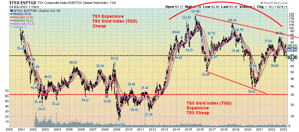
TSX Composite/TSX Gold Index (TGD) Ratio
Source: www.stockcharts.com
When we compare gold stocks to the stock index, the conclusion is the same. The chart above of the TSX Composite/TSX Gold Index (TGD) ratio shows that gold stocks remain cheap vs. the broader stock index. If we showed the S&P 500/HUI ratio, the story would be the same. Gold stocks are cheap vs. the broader stock market index. Note how the TSX/TGD ratio is putting in lower highs and lower lows, indicating to us that we are in an ongoing downtrend. The message remains positive to accumulate the TGD stocks over the TSX itself.
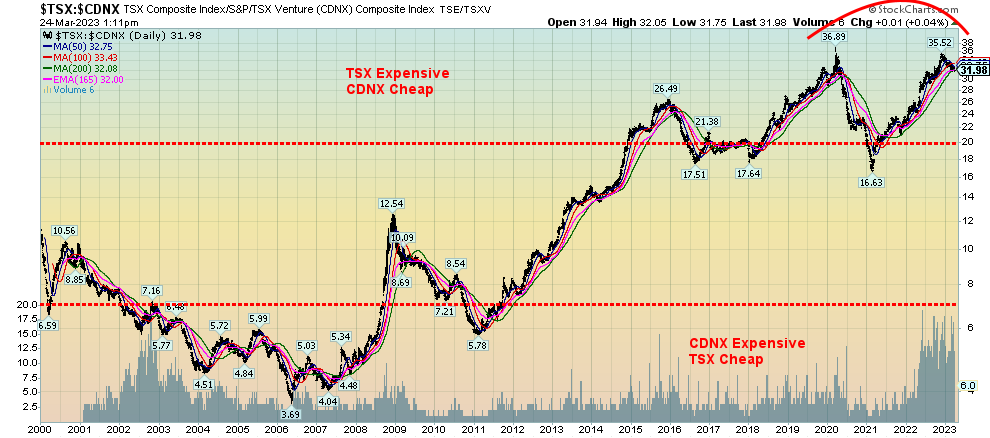
Finally, the small cap TSX Venture Exchange (CDNX) remains very cheap vs. the TSX Composite. Our final chart of the TSX/CDNX ratio is also shown. The CDNX has over 1,600 companies listed, of which upwards of half are junior mining companies. That ratio has remained high in favour of the TSX since 2013 as well. Currently at 32.50, it is not far off its high set in 2020 at 36.89. The low was seen in 2006 at 3.69.
Chart on next page
TSX/CDNX Ratio
Source: www.stockcharts.com
Markets & Trends
|
|
|
|
% Gains (Losses) Trends
|
|
||||
|
|
Close Dec 31/22 |
Close Mar 24/23 |
Week |
YTD |
Daily (Short Term) |
Weekly (Intermediate) |
Monthly (Long Term) |
|
|
Stock Market Indices |
|
|
|
|
|
|
|
|
|
`S&P 500 |
3,839.50 |
3,970.99 |
1.4% |
3.4% |
down |
neutral |
neutral |
|
|
Dow Jones Industrials |
33,147.25 |
32,237.53 |
1.2% |
(2.7)% |
down |
neutral |
neutral |
|
|
Dow Jones Transport |
13,391.91 |
13,706.59 |
(0.5)% |
2.4% |
down |
neutral |
up |
|
|
NASDAQ |
10,466.48 |
11,823.96 |
1.7% |
13.0% |
up (weak) |
neutral |
neutral |
|
|
S&P/TSX Composite |
19,384.92 |
19,509.49 |
0.6% |
0.6% |
down |
neutral |
up |
|
|
S&P/TSX Venture (CDNX) |
570.27 |
611.88 |
1.1% |
7.3% |
down |
neutral |
down (weak) |
|
|
S&P 600 (small) |
1,157.53 |
1,140.23 |
0.6% |
(1.5)% |
down |
down |
neutral |
|
|
MSCI World Index |
1,977.74 |
2,062.65 |
3.9% |
4.3% |
down (weak) |
up (weak) |
neutral |
|
|
Bitcoin |
16,535.23 |
28,009.11 |
6.1% |
69.4% |
up |
up |
neutral |
|
|
|
|
|
|
|
|
|
|
|
|
Gold Mining Stock Indices |
|
|
|
|
|
|
|
|
|
Gold Bugs Index (HUI) |
229.75 |
248.13 |
2.5% |
8.0% |
up |
up |
down (weak) |
|
|
TSX Gold Index (TGD) |
277.68 |
298.11 |
12.2% |
7.4% |
up |
up |
neutral |
|
|
|
|
|
|
|
|
|
|
|
|
% |
|
|
|
|
|
|
|
|
|
U.S. 10-Year Treasury Bond yield |
3.88% |
3.37% |
(1.7)% |
(12.9)% |
|
|
|
|
|
Cdn. 10-Year Bond CGB yield |
3.29% |
2.75% |
(1.1)% |
(16.4)% |
|
|
|
|
|
Recession Watch Spreads |
|
|
|
|
|
|
|
|
|
U.S. 2-year 10-year Treasury spread |
(0.55)% |
(0.40)% |
4.8% |
(27.3)% |
|
|
|
|
|
Cdn 2-year 10-year CGB spread |
(0.76)% |
(0.68)% |
11.7% |
(10.5)% |
|
|
|
|
|
|
|
|
|
|
|
|
|
|
|
Currencies |
|
|
|
|
|
|
|
|
|
US$ Index |
103.27 |
102.76 |
(0.6)% |
(0.5)% |
down |
down |
up |
|
|
Canadian $ |
73.92 |
72.87 |
(0.2)% |
(1.4)% |
down |
down |
down |
|
|
Euro |
107.04 |
107.63 |
0.9% |
0.6% |
up (weak) |
up |
down |
|
|
Swiss Franc |
108.15 |
108.72 |
0.8% |
0.5% |
up |
up |
up (weak) |
|
|
British Pound |
120.96 |
122.33 |
0.5% |
1.1% |
up |
up (weak) |
down |
|
|
Japanese Yen |
76.27 |
76.48 |
1.0% |
0.3% |
up |
up |
down |
|
|
|
|
|
|
|
|
|
|
|
|
|
|
|
|
|
|
|
|
|
|
Precious Metals |
|
|
|
|
|
|
|
|
|
Gold |
1,826.20 |
1,983.80 |
0.5% |
8.6% |
up |
up |
up |
|
|
Silver |
24.04 |
23.34 |
3.9% |
(2.9)% |
up |
up |
neutral |
|
|
Platinum |
1,082.90 |
983.90 |
0.5% |
(9.1)% |
up (weak) |
up (weak) |
neutral |
|
|
|
|
|
|
|
|
|
|
|
|
Base Metals |
|
|
|
|
|
|
|
|
|
Palladium |
1,798.00 |
1,414.40 |
2.0% |
(21.3)% |
down |
down |
down |
|
|
Copper |
3.81 |
4.07 |
4.6% |
6.8% |
up (weak) |
up |
up (weak) |
|
|
|
|
|
|
|
|
|
|
|
|
Energy |
|
|
|
|
|
|
|
|
|
WTI Oil |
80.26 |
69.26 |
3.5% |
(13.7)% |
down |
down |
neutral |
|
|
Nat Gas |
4.48 |
2.36 |
0.9% |
(47.3)% |
down |
down |
down (weak) |
|
Source: www.stockcharts.com
Note: For an explanation of the trends, see the glossary at the end of this article.
New highs/lows refer to new 52-week highs/lows and, in some cases, all-time highs.
Source: www.stockcharts.com
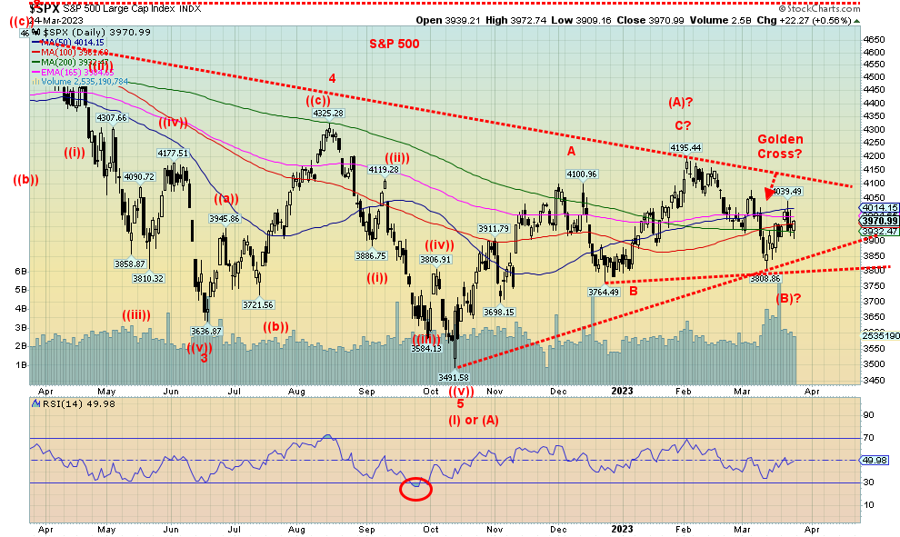
Another volatile week for the stock market. Surprisingly, stock markets managed to eke out gains for the week. But even that varied. The S&P 500 was up 1.4% on the week, the Dow Jones Industrials (DJI) gained 1.2%, but the Dow Jones Transportations (DJT) diverged and fell 0.5%. Indeed, the DJT fell to new lows this past week for the current down move but the DJI did not. A divergence. Both indices are hovering under the 200-day MA. The NASDAQ gained 1.7%, the S&P 400 (MID) was up 1.3% while the S&P 600 (Small) gained 0.6%. Of the indices, the DJI, the Mid, and the Small are all in negative territory for 2023. The NASDAQ is the best, up about 13% thus far in 2023.
In Canada, the TSX Composite gained 0.6% while the TSX Venture Exchange (CDNX) was up 1.1%. In the EU, the London FTSE gained about 1.0%, the EuroNext was up 1.4%, the Paris CAC 40 gained 1.4%, and the German DAX was up 1.3%. In Asia, China’s Shanghai Index (SSEC) gained 0.4%, Hong Kong’s Hang Seng (HSI) was up 2%, and Japan’s Tokyo Nikkei Dow (TKN) was up 0.2%. For the curious, Russia’s Moex Index (stock market) was up about 2.9% on the week 11% thus far in 2023. Interestingly, Russian banks rose on the week even as banks elsewhere fell. Russia has capital controls and its shift to Asia is paying dividends. Not everyone is on board with U.S.-led Western sanctions. Even the ruble is up 6.6% so far in 2023.
The big question is, has the S&P 500 completed its correction of the big down move of 2022? The S&P 500 topped in January 2022 and made its bottom in October down at the time 27.5%. It finished the year down, just over 20% from its all-time high seen in early January.
The line in the sand for a further rebound lies at that December low of 3,764. If that falls, all bets are off for a positive year in 2023 and the bets could be on that we are headed to new lows. Elliott Wave International (www.elliottwave.com) firmly believes we are in the throes of another major down wave and the correction from October 2022 to the peak in February 2023 at 4,195 is marking the end of Wave 2 or Wave B. We are now in the early stages of Wave 3 (or it could be the C wave) to the downside that will carry us to new lows either later this year or in 2024. Unless the S&P 500 can regain the recent high of 4,039, the odds favour instead new lows below 3,800 then a break of the December low of 3,764. Thoughts of a recession are creeping back in. From our perspective, the recession should be underway in Q3 and possibly even in Q2. Recall the 2007–2009 recession didn’t end until the Fed was well on its way to cutting interest rates to zero and doling out trillions of dollars of QE.
Will the Fed accommodate and cut rates to zero again, once again doling out trillions in QE? We wouldn’t bet on it as we continue to believe the Fed and the other central banks are caught between a rock and hard place. Recession vs. inflation. Who wins out? The washout and long overdue major correction that should have happened from the 2008 financial crisis is underway. They have run out of bullets.
Source: www.stockcharts.com
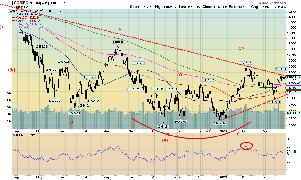
The NASDAQ tinkered this past week with breaking out of a downtrend line, but so far has failed. No, the failure is not confirmed. A break back down under 11,500 would confirm a failure. A move above 12,000 would be very positive and point to higher levels. The NY FANG Index gained 3.6% on the week, so there appears to be some move back into risk on stocks. Note as well the up week for Bitcoin once again as well that gained 6.1% to over $28,000. Of course, now we are seeing headlines of Bitcoin going to $100,000 once again. Of the FAANGS, Netflix was a big winner, up 8.2% on the week. Nvidia continued its recent winning ways, gaining 4.1% to fresh 52-week highs. The only loser was Amazon, down 0.8%. While a break back under 11,500 would confirm that a top may be in, the real breakdown occurs under 11,200. This would ensure a break under the recent March low of 10,982. Once that breaks, new lows become probable. What’s key has been a rebound in the tech stocks. But if that rebound fades, all bets are off and the NASDAQ will turn south once again. We also have a divergence (so far) at the high seen this week. The NASDAQ 100 Composite made new highs, but the NASDAQ Composite did not. Naturally, it is too soon to tell whether this divergence holds, but a break under 11,500 could start the confirmation.
Source: www.stockcharts.com
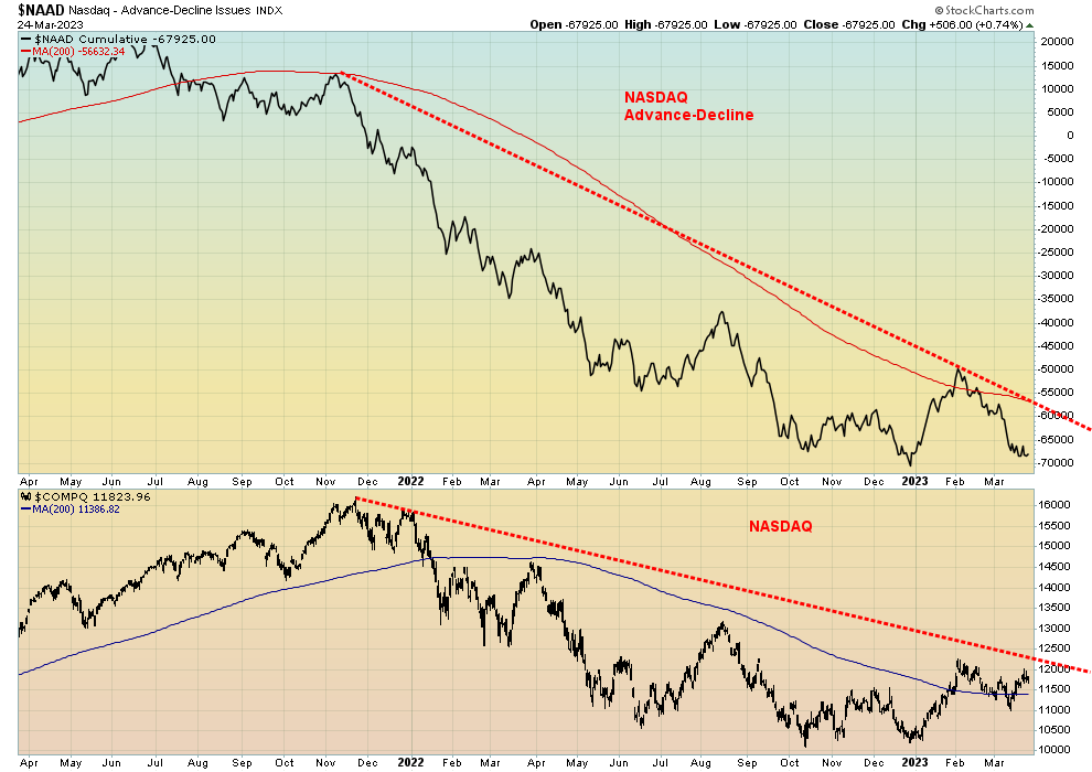
Even the NASDAQ and the NASDAQ Advance-Decline line are diverging, with the NASDAQ rebounding but the AD line barely budging and planted firmly below its 200-day MA, even as the NASDAQ recovered its 200-day MA. All this tells us is that the current rally should not be followed. It will fail.
Source: www.stockcharts.com
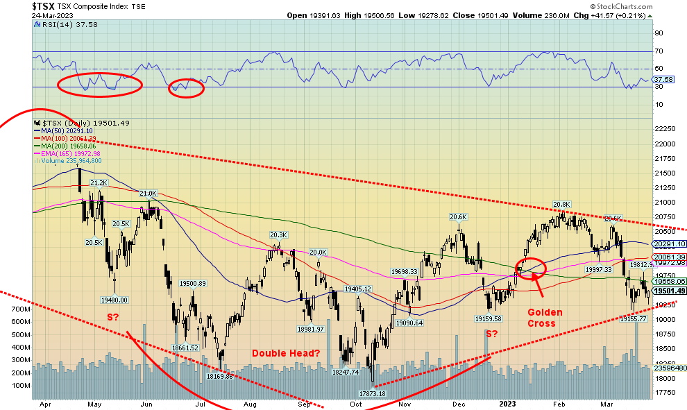
The TSX Composite managed to eke out a gain of 0.6% this past week. The TSX Venture Exchange (CDNX) also rebounded, up 1.1% and now up 7.3% on the year. No matter how we look at it, the CDNX continues to be looking like a buy. Of the 14 sub-indices on the TSX, nine were up while five were down. Leading the way to the downside was Real Estate (TRE), off 1.7%. The much-maligned Financials (TFS) led by the banks was up 0.3% on the week. Leading the way to the upside was Golds (TGD), up 2.7%. Energy (TEN) gained 2.2% while Metals & Mining (TGM) was up 1.9%. Friday’s rebound to the upside looks positive, and as long as we can hold above 19,250, we should move higher. Still, we are long way from breaking out. That doesn’t come until we are over 20,500. Right now, the up move from a low of 17,873 in October to a peak of 20,800 in February looks like an ABC corrective pattern. If that is the case, then this is just a bounce in an unfolding new wave to the downside. Hence, why 19,250 now is important and if it breaks, then the odds favour further downside. Below 19,000 confirms the breakdown and under 18,550 new lows are highly probable. Golds continue to look like the best place to be as well as Metals & Mining and Materials (TMT).
U.S. 10-year Treasury Bond/Canadian 10-year Government Bond (CGB)
Source: www.tradingeconomics.com, www.home.treasury.gov, www.bankofcanada.ca
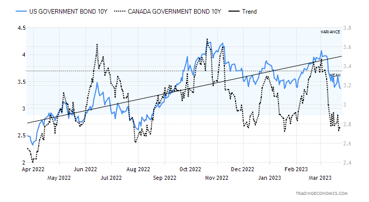
Bonds continue to rally. The 10-year U.S. treasury note fell to 3.38% this past week, down from 3.44% the previous week. Even the 2-year fell as it was down to 3.77%. On March 8, the 2-year topped out at 5.07%. That has helped lower the 2–10 spread to 40 bp as we continue the march towards normalization of the yield curve. When the yield curve normalizes, the recession typically gets underway. Bonds are rallying (price up as prices move inversely to yields) because thoughts are turning to the Fed pausing its rate hikes. Some even believe that the Fed will pivot and cut rates later this year as the recession takes hold. The drop below 3.50% for the 10-year points to a possible drop now closer to 3.00%. Below 3.00%, further declines could be seen. In Canada, the story is the same as the 10-year Government of Canada bond (CGB) fell to 2.75% from 2.78% and the 2–10 spread fell to 68 bp, down from 77 bp the previous week. The Canada 2–10 spread peaked at over 100 bp.
This past week brought central bank rate hikes: the Fed, the ECB, and the BOE. The week didn’t bring a host of numbers, but housing starts and sales were stronger than expected and the weekly initial claims came in below 200,000 again and below expectations. Inflation in Canada moderated and retail sales in Canada were stronger than expected. This coming week brings us the Case-Shiller house prices, the Conference Board’s consumer confidence, the final Michigan Sentiment Index for March, the GDP final for Q4 2022, and PCE prices.
Source: www.stockcharts.com
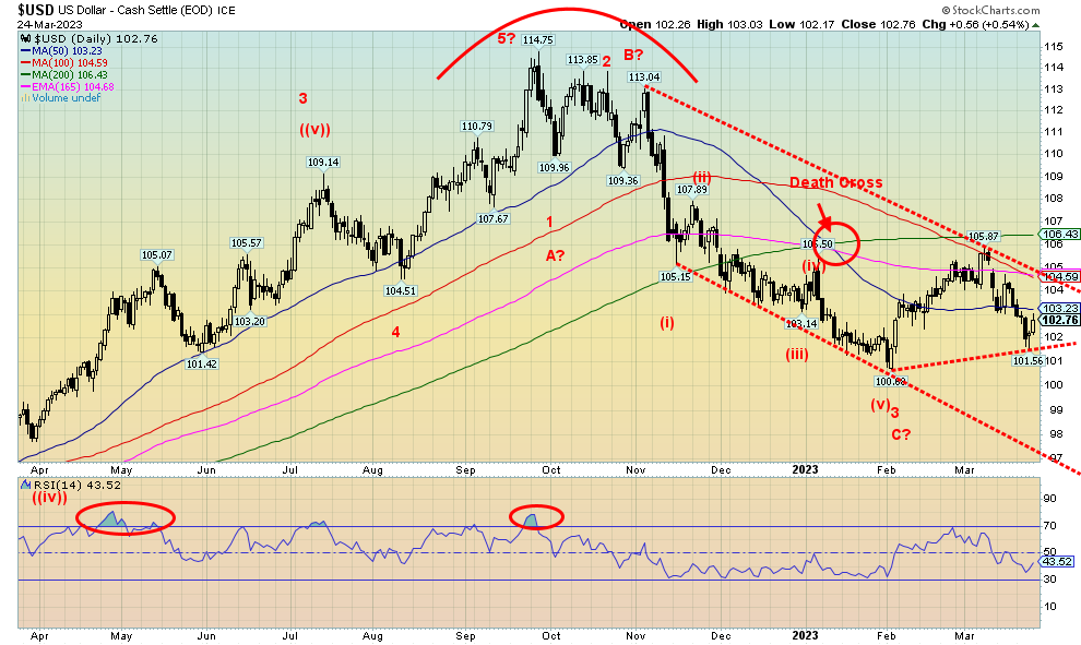
It is difficult to say whether the US$ Index has completed its recent correction. Given we made new lows below 100 on this pullback, the US$ Index remains open to interpretation as to whether it can move higher once again or fail and break down. Last week’s low was at 101.56 and if that falls, then the odds favour at minimum a test of 100.00. A breakdown under 100.00 would be negative and suggest that that the rebound is over.
The US$ Index fell 0.6% this past week as the currencies rose. The euro was up 0.9%, the Swiss franc gained 0.8%, the pound sterling up 0.5%, while the Japanese yen was up 1.0%. The Canadian dollar was a loser, off 0.2%. The Canadian dollar is being held back by weak oil prices, given oil is Canada’s largest export.
The US$ Index has resistance up to 104.50, but a breakout above 104.75 would set up a test of the 200-day MA near 106.50. On Friday, the US$ Index rebounded as fear of bank contagion hurt banks, but tech and others (risk on) bounced back. One of the biggest threats to the US$ Index is the BRICS (and others) that are challenging US$ supremacy and hegemony. The BRICS, led by China, continue to build an infrastructure to challenge US$ hegemony. They are building their own version of the IMF, the World Bank, and SWIFT, the payments system. They are also backing their currencies with gold in order to strenthen them and give their currencies real value. Simply put, the BRICS de-dollarization is a major threat to global economic order. In our opinion, this is the major reason for the growing tension between the U.S. and China and also helps explain the U.S.’s backing of Ukraine in its war against Russia (the R in BRICS). U.S. hegemony is slipping, given recent
connections between China and Saudi Arabia and with pricing of oil in yuan and Saudi Arabia and Iran reconnecting. All this is a challenge to U.S. global hegemony and U.S. dollar supremacy. It could also lead to World War III. This is a picture we’ve seen before the last major one between Great Britain (pound sterling) and Germany (Deutsche Mark) that led to World War I. Does history repeat itself? Or is it rhyming?
Source: www.stockcharts.com
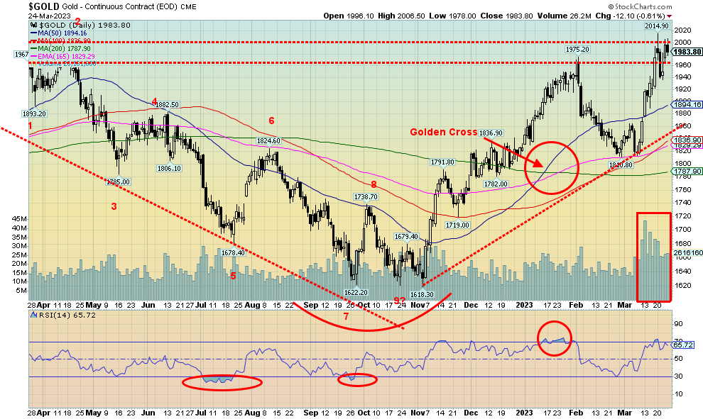
Bank contagion helped push gold briefly over $2,000 this past week. Gold was also acting as a safe haven (along with U.S. treasury bonds, notes, and, bills) and betting on a pause in the Fed’s interest rate hikes. With $2,000 being a major resistance and psychological level, it is probably not surprising it got pushed back at that level as profit-taking set in and sellers not wanting to see it over $2,000 also stepped in. On Friday, the U.S. dollar rebounded, causing the stock market to reverse and go up. But at the end of the week the stock market was relatively flat while gold gained for the fourth consecutive week. Banking contagion certainly helped, with rumours of Deutsche Bank adding to the fear.
On the week, gold rose 0.5% after being pushed back from $2,000 on Friday. Silver was up 3.9%, platinum gained 0.5%, palladium rebounded up 2.0%, and copper gained 4.6%. The gold stocks also rallied with the Gold Bugs Index (HUI) up 2.5% and the TSX Gold Index (TGD) gaining 2.7%. Gold along with copper are the only two
up on the year, however, with gold up 8.6% and copper up 6.8%. Silver is down 2.9%, platinum is off 9.1%, and palladium down 21.3% so far in 2023.
Technically, gold is stalling at the $2,000 level but once firmly through that level (we like to see it through for 2–3 days to confirm) we can focus on the all-time high at $2,089. New highs become a likelihood. The RSI has slipped to about 66, so we have room to rise further. We were briefly over 70 when some profit-taking set in. Volume is noticeably higher through this rise, supporting the rise for gold.
As we note, gold is being considered a safe haven from all the turmoil in the banking market. Fear of recession, fear of the Fed pausing, fear of banking contagion, and fear that the Fed and the government can do very little to stem the bleeding. Would they really lower interest rates once again to zero and dole out oodles of QE once again? You can only play that game so often and then it begins to lose its impact. And there is still the looming debt limit fight which could also be positive for gold.
The CFTC remains behind on its updating of the commitment of trader’s report (COT). The last one is dated March 7. If we were up to date, it would be dated March 21. At least the COT is encouraging as the commercial COT for gold is up to 34%, the highest level seen since October before another rise in gold’s price. The silver commercial COT is even better at 47%, again the highest level seen since September/October 2022 before another rise. As the gold price has been rising, open interest is also rising, a positive development.
We are encouraged by gold’s rise. The high thus far has been about $2,015. Once through $2,000 on a close basis, the next level of resistance is at $2,020/$2,025. Expect a lot of resistance at the highs of $2,079/$2,089. But once through $2,100 it could bring in a lot of new players. It would also help that silver starts making new highs as well. But silver remains a long way off from its all-time highs near $50. The perennial gold bugs are all salivating at gold’s rise, but they have been doing that for years, even when it was sinking. Maybe gold’s day in the sun is coming.
To the downside, $1,875 remains our line in the sand. Although at this point, we are getting ready to move that up to $1,925. New highs are important and, ideally, we’d like to see that this coming week.
Source: www.stockcharts.com
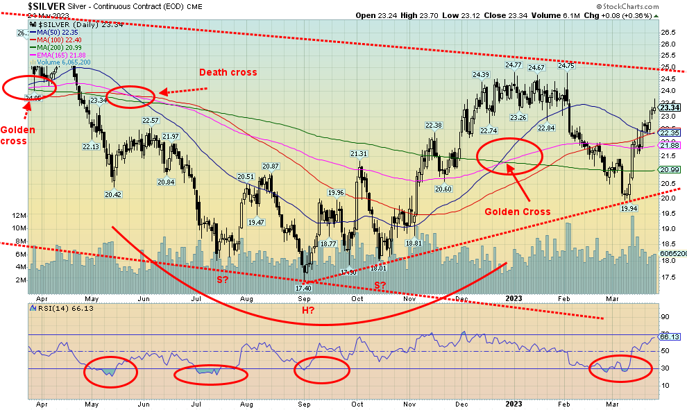
Silver prices are moving higher, gaining 3.9% this past week. Still, that leaves them below the earlier high of $24.77. Meanwhile, gold has taken out its previous high of $1,975. That’s a negative divergence until silver makes new highs as well. Silver remains down on the year by 2.9%. A firm breakout for silver does not kick in until over $25. Support is now down to $22.50, $21.75, and $21. Below $21 spells trouble and below $20 we could go back down to test the low of $17.40. With an RSI at 65, silver still has room to move higher. Silver’s earlier golden cross is threatening to cross under, giving us a death cross. However, more likely it’s a kiss before silver takes off higher. Again, our major concern with silver is its failure thus far to make new highs with gold. It’s essential that it does and soon.
Source: www.stockcharts.com
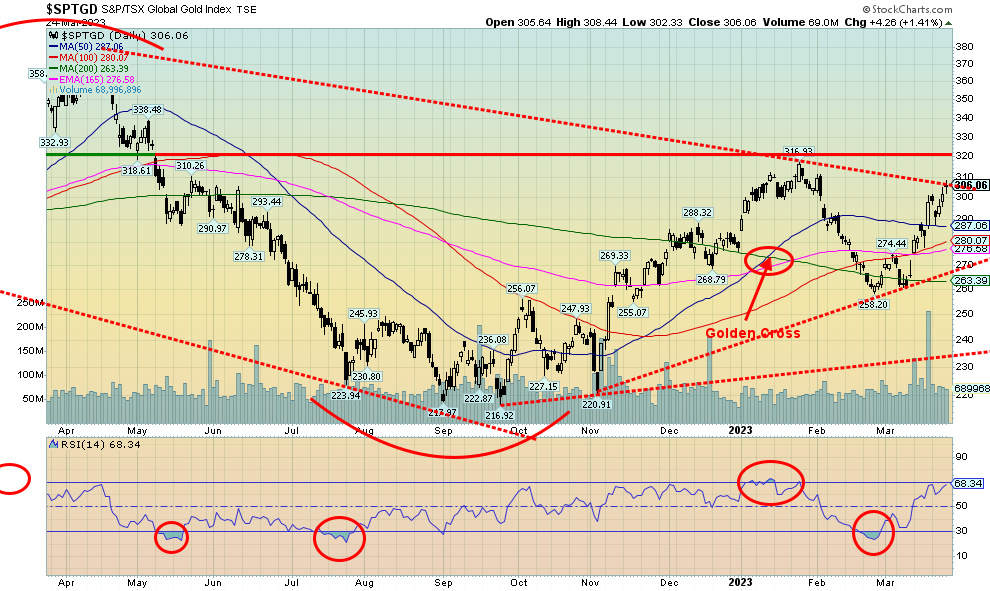
Are the gold stocks poised to break out further? We have passed the point for the TSX Gold Index (TGD) to suggest that new high above 317 is possible. Over 320 the TGD breaks out. This past week the TGD gained again, up 2.7% while the Gold Bugs Index (HUI) was up 2.5%. Both indices are now in the black for 2023 with the TGD up 10.2% and the HUI up 8.0%. With an RSI at 68 the TGD still has room to move higher. The Gold Miners Bullish Percent Index (BPGDM) is at a rather neutral 51%. Lots of room to move higher there as well. And, as we note in our chart of the week, the gold stocks remain ludicrously cheap when compared to gold or the broader indices such as the S&P 500 and the TSX Composite. Crypto mania has never yet caught the gold stocks. Gold bugs, we are sure, are jumping at the thought that it could happen to them as well. The market is small enough. Compare the world’s largest company Apple with a market cap of $2.5 trillion with the world’s largest gold mining company Newmont at $38.6 billion and you get the picture. The market cap of all the gold mining companies wouldn’t even crack the top ten of companies. It’s a small market and a small shift of funds to the sector could move the price of companies up quickly. Compare that to the market cap of all the gold in the world which is roughly $13 trillion. Even that doesn’t come close to the GDP of the U.S. Long-term support for the TGD is down at 270, but at this stage we’d prefer to see 285 hold. As noted, the breakout is at 320, then again at 340.
Source: www.stockcharts.com
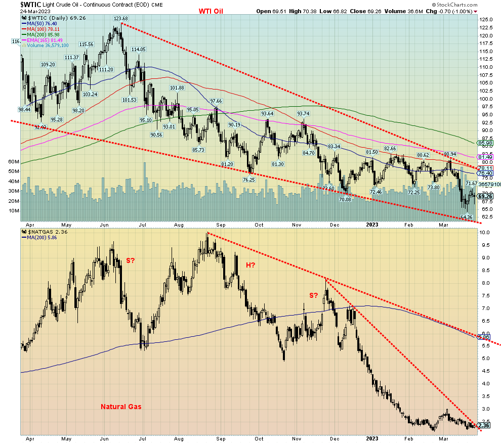
Fears of recession coupled with a communique from the White House that the U.S. was not refilling the Special Petroleum Reserve (SPR) has helped keep a cap on oil prices under $70. A rebounding U.S. dollar and an unfolding banking crisis are also helping to keep a lid on oil prices. That means that consumers will continue to enjoy cheaper gasoline prices for a bit longer. Gasoline stocks did take a big dip this past week in the U.S. and that might help keep the price of crude elevated as demand rises. This past week WTI oil was up 3.5% while Brent crude rose 0.6%. Natural gas (NG) also was up, but a very slim 0.9%. NG at the Dutch Hub caught up to the Henry Hub NG this past week, falling by 4.1%. All of this helped the energy stocks as the ARCA Oil & Gas Index (XOI) was up 1.7% and the TSX Energy Index (TEN) gained 2.2%. Technically, there is not a lot to say. WTI oil remains in its downtrend that still looks like a huge descending wedge triangle. A breakout above $78 now still seems a fair distance away while the bottom of the bear channel is around $61. So, lots of room to move higher without breaking out. That 200-day MA seems a long way off at $86. NG remains in a downtrend, but it is getting close to at least to breaking the most recent steep downtrend. A move above $2.50 would do the trick. But the downside could still be tempting and it wouldn’t take much to push NG down below $2.10 and new lows. That more gentle downtrend line for NG is a long way off at around $5.60. The highs of August 2022 at $10 seem but a distant memory.
Copyright David Chapman 2023
|
GLOSSARY
Trends
Daily – Short-term trend (For swing traders) Weekly – Intermediate-term trend (For long-term trend followers) Monthly – Long-term secular trend (For long-term trend followers) Up – The trend is up. Down – The trend is down Neutral – Indicators are mostly neutral. A trend change might be in the offing. Weak – The trend is still up or down but it is weakening. It is also a sign that the trend might change. Topping – Indicators are suggesting that while the trend remains up there are considerable signs that suggest that the market is topping. Bottoming – Indicators are suggesting that while the trend is down there are considerable signs that suggest that the market is bottoming. |
Disclaimer
David Chapman is not a registered advisory service and is not an exempt market dealer (EMD) nor a licensed financial advisor. He does not and cannot give individualised market advice. David Chapman has worked in the financial industry for over 40 years including large financial corporations, banks, and investment dealers. The information in this newsletter is intended only for informational and educational purposes. It should not be construed as an offer, a solicitation of an offer or sale of any security. Every effort is made to provide accurate and complete information. However, we cannot guarantee that there will be no errors. We make no claims, promises or guarantees about the accuracy, completeness, or adequacy of the contents of this commentary and expressly disclaim liability for errors and omissions in the contents of this commentary. David Chapman will always use his best efforts to ensure the accuracy and timeliness of all information. The reader assumes all risk when trading in securities and David Chapman advises consulting a licensed professional financial advisor or portfolio manager such as Enriched Investing Incorporated before proceeding with any trade or idea presented in this newsletter. David Chapman may own shares in companies mentioned in this newsletter. Before making an investment, prospective investors should review each security’s offering documents which summarize the objectives, fees, expenses and associated risks. David Chapman shares his ideas and opinions for informational and educational purposes only and expects the reader to perform due diligence before considering a position in any security. That includes consulting with your own licensed professional financial advisor such as Enriched Investing Incorporated. Performance is not guaranteed, values change frequently, and past performance may not be repeated.


