For the last 2 days our internet has been down which really makes you appreciate this miracle invention. We’ve had intermittent problems through the years that no one has been able to figure out until today. The phone company finally came to the conclusion that there was a tiny defect in their phone line that would only show up from time to time which made the problem so hard to track down. Today they replaced 1/4 of a mile of telephone line which seems to be working. We’ll know in a few days if this fix is going to work which I can already tell is working.
I would like to start out by looking at the long term weekly combo chart for the PM complex we’ve been following since its inception. I’m out of annotations so you’ll have to use your own imagination where the areas that need a trendline or a breakout symbol occurs.
I just wanted to point out that these are massive 4 year reversal patterns that suggests years of bull market price action. A whole lot of energy has now been stored up in these 4 year trading ranges. Big bull markets don’t start from small reversal patterns but the bigger the bottom the bigger the bull market.
If you think our current consolidation phase is wearing you out you should have been with us during the formation of the blue falling wedge which started to form at the 2016 high using the HUI for example. After the double H&S top reversal pattern was confirmed all we knew was that the 2016 vertical rally was finished and needed to consolidate its gains. Back then there was no way to know how long or how deep the correction would be only that some type of consolation pattern would build out.
For 2 long agonizing years of steady falling prices the blue falling wedge finally showed itself which was the first ray of hope we had seen in the last 2 years. Again, looking at the HUI you can see the breakout and then the long and laborious backtest to the top rail which took around 6 months to complete. Everything about that period in the PM complex was hard. Even after the backtest was finished and the impulse move up began I had to ask the question on whether the blue falling wedge was going to be a stand along pattern, meaning it will be THE consolidation that finally leads the PM stocks out of its bear market. On the other hand the minimum price objective for a falling wedge like this is up to the first reversal point where it began to develop. The only good thing about that 2 year blue falling wedge is that we didn’t trade the PM stocks during that time but focused on the 2 year rally in the stock markets trading our 3 X etfs. We did try a couple of Kamikaze trades but that was about it.
As you can see the price objective fell just shy of reaching all the way to the first reversal point before we got that final capitulation move into the March 23rd low. That move was the final nail in the coffin for the bears. I hope you can appreciate the rally out of the 5th reversal point in the 5 point triangle reversal pattern. You just don’t see moves like this very often as they are pretty rare, but since it was the beginning of something and not the end of something like in 2016, our current powerful rally is suggesting a strong bull market is upon us. The bigger the initial breakout out move in either a new bull or bear market can tell you to expect a big move over many years. The power of our current breakout move is talking to us.
There is one last point I would like to make and that is the tops of the 2016 trading ranges are my line in the sand for our current bull market, above is bullish and below is bearish.
I would like to switch gears and look at the DBC weekly combo chart for many of the commodity related indexes we haven’t looked at in awhile, The first thing to notice on this combo chart are all the large H&S tops. You may recall we first spotted these H&S tops during the formation of the right shoulder which prepared us for the breakout move to the downside which was part of the 2020 crash that just about everything related to the markets crashed.
Looking at the DBC chart on top you can see the price objective for its H&S top came in right on the money. At the initial low I suggested we could either see a new consolation pattern start to form or some type of reversal pattern as the price objective was hit. As you can see DBC formed a perfect double bottom reversal pattern which reversed the impulse move down.
After the initial rally out of the 2020 crash low we can now see some small blue consolidation patterns starting to form on top of their 30 week ema. So far only the GYX, industrial metals fund has broken back above its neckline which is showing relative strength. The DBB, base metals fund is currently testing its neckline from below. Those small blue consolidation patterns will most likely show up as a halfway pattern out of the March 2020 crash low.
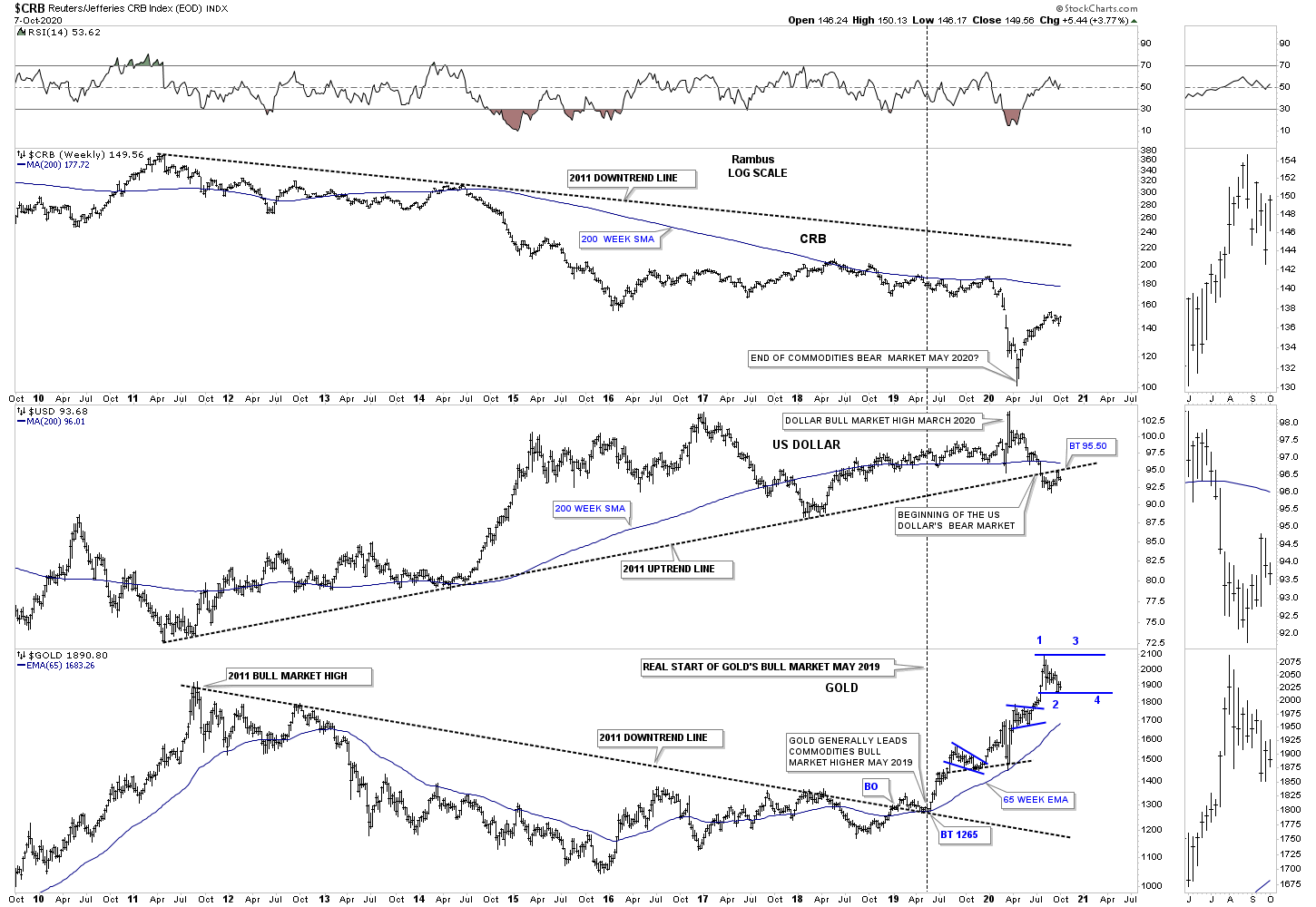
Next is the triple combo chart we just looked at recently which shows the CRB on top with the US dollar in the middle and gold on the bottom. When you look at that final decline in the CRB index into the 2020 March crash low that is the same decline that we just looked at on the combo chart above. As you can see I stated that that capitulation low would likely mark the end of the bear market in commodities. Looking at the US dollar in the middle it still has some serious work to do if it is going to rally back above that bottom rail of the 2011 uptrend channel. The 200 week sma is also just overhead.
I’m not going to get in to it right here but you can see where I extended the top and bottom rails on the gold chart. Just from purely a visual perspective gold has had one heck of a rally since the middle of 2018 with only a couple of small consolation patterns. The symmetry of this move suggests that gold could use a little more time to consolidate its gains which would be very healthy in the long run.
I guess I’m going to get into more than I planed at this time. If gold is building out a bigger consolation pattern how will it affect the PM stock indexes? First if we are witnessing the 2nd reversal point low then gold is most likely going to rally back up toward the top of the new trading range. While gold rallies up to the top of its new trading range the PM stock indexes will breakout out of their now 9 week consolidation patterns along with gold. While gold may reach the top of its previous high the PM stock indexes will finally take out their most recent high and for the first time in a long time the PM stocks may finally start to outperform gold in a big way. That’s really the last piece of the puzzle that I would like to see.
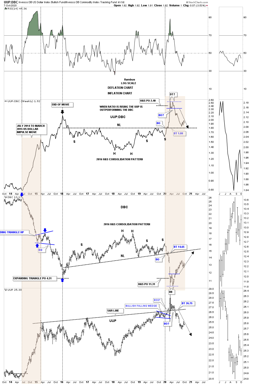
Below is another triple combo chart we haven’t looked at in awhile which has the UUP:DBC ratio chart on top with the DBC commodity index in the middle with the UUP on the bottom. You may recall I added the black arrows soon after the double bottom breakouts to show you the direction of the move I was expecting. Note how the ratio chart on top has finally declined all the way down to its neckline and is getting a bounce. That is exactly what we want to see which tells us the neckline is still hot and properly placed. After a small rally like we are now seeing, if the ratio is going to break below the neckline now is a good as time as any to see some follow through to the downside. Keep in mind it hasn’t happened yet but the setup is there.
At some point the DBC is going to have to interact with its neckline before taking it out which we’ll be able to follow in real time. The UUP will have to rally all the way up past its S&R line at 26.75 to negate it.
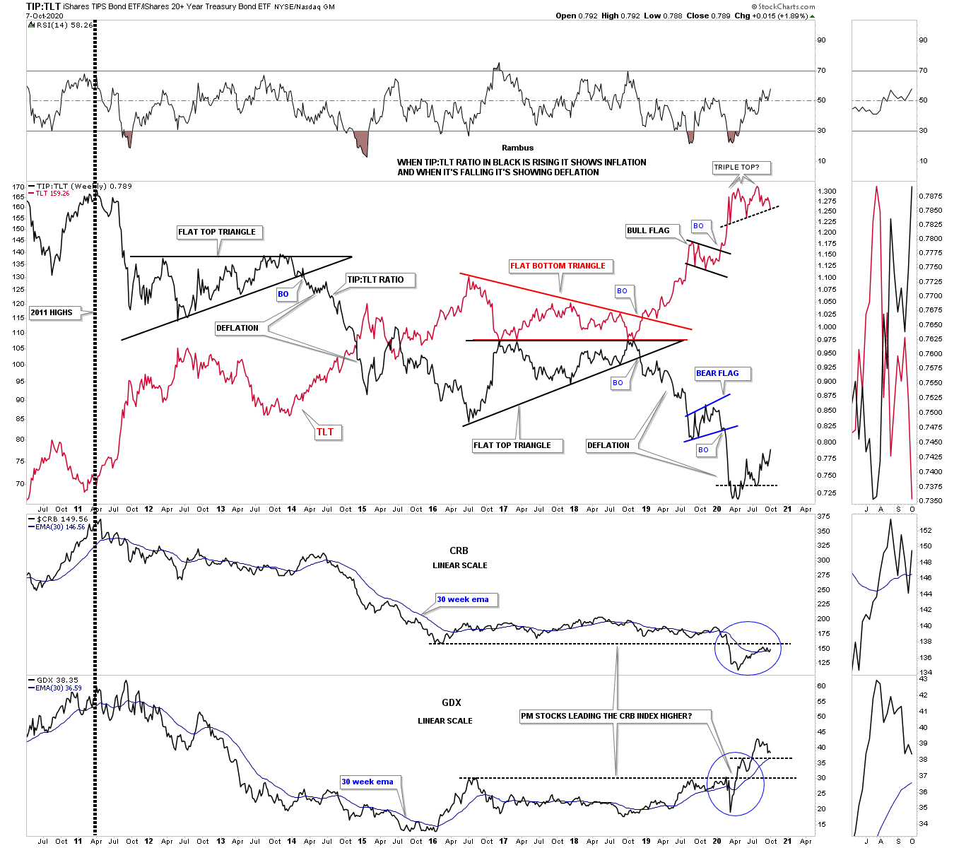
Below is another combo chart we haven’t looked at in awhile which I use to help understand if we are in an inflationary or deflationary environment. First note the ratio in black on the TIP:TLT chart with the TLT in red. When the ratio in black is falling that shows general deflation and just the opposite when it is rising, inflation. That triple top on the TLT in red is still building out but is now getting much closer to breaking out to the downside. If that were to occur the ratio in black would start to rise which would suggest the beginning of inflation.
At the bottom of the chart you can see the CRB index with the GDX below it. There is an old expression that says gold and PM stocks generally lead the commodity complex first and commodities will soon follow. Note how the GDX has broken out above overhead resistance while the CRB is just now starting to approach its overhead resistance line. What I’m looking for is to see the TIP:TLT ratio, CRB and the GDX all rise together.
For now this is a general roadmap that we can keep an eye on which should set up some interesting trades. They say there is always a bull market somewhere but you just have to know where to look. All the best…Rambus


