“By a continuing process of inflation, government can confiscate, secretly and unobserved, an important part of the wealth of their citizens.”
—John Maynard Keynes, English economist whose ideas fundamentally changed the theory and practice of macroeconomics and economic policies of governments, author of The General Theory of Employment, Interest and Money (1936) and others; 1883–1946
“I do not think it is an exaggeration to say history is largely a history of inflation, usually inflations engineered by governments for the gain of governments.”
—Friedrich August von Hayek, Austrian-British economist and philosopher, defender of classical liberalism, author of The Road to Serfdom (1944) and others; 1899–1992
“Inflation is as violent as a mugger, as frightening as an armed robber and as deadly as a hit man.”
—Ronald Reagan, 40th president of the United States 1981–1989, influential voice of modern conservatism, 33rd governor of California 1967–1975, 9th and 13th president of the Screen Actors’ Guild 1947–1952 and 1959–1960, radio and film actor Hollywood 1937–1964; 1911–2004
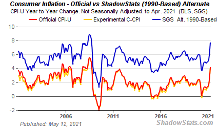
Inflation hysteria! Or is it fear of the “I” word? We can’t seem to escape inflation. Maybe Reagan is right—it’s a mugger, an armed robber, a deadly hit man. We suppose it was to be expected. After all, we’ve been building for it for weeks. For the record, the April CPI came in up 0.8%, the core inflation up 0.9%. It beat expectations of 0.2% and 0.3% respectively. That left the year-over-year inflation up 4.2% vs. 2.6% in March and expectations of a gain of 3.6% while the core year-over-year is up 3.0% vs. 1.6% in March and expected 2.3%. Any minute now we’ll witness Jerome Powell slitting his throat. 3%! My god! Our target is only 2%! We were willing to tolerate up to 2.5%, but 3%? That’s the highest inflation level seen since 2009 and the highest core inflation seen in 25 years. Inflation hysteria reigns.
Source: www.shadowstats.com
The PPI that followed didn’t fare much better. April PPI year-over-year came in at 6.2% while the core PPI was up 4.1%. Both were above expectations of 5.9% and 3.7% respectively. It added to the concern that is now stalking the markets.
Shadow Stats (www.shadowstats.com) has a great way of tweaking everything, whether it be inflation, unemployment, or GDP. Take the inflation numbers. Shadow Stats reports two sets of numbers. One, the red line, is the official stats as released by the U.S. Bureau of Labour Statistics (BLS). The second blue line is the Shadow Stats calculations based on how inflation was calculated back in 1990. Shadow Stats also provides another set of alternate CPI on how it was calculated back in 1980. So, what happened? Well, the method of calculation is recalibrated through methodological shifts that move the CPI from being a measure of the standard of living to one needed to maintain a standard of living. Beef too expensive? Hamburger is cheaper, so substitute. Technological changes also play a role. So, more computing power lowers the cost even if the overall cost didn’t change or went up. The official reported CPI for April – 4.2%. The Shadow Stats CPI – 12.1%. Bit of a difference.
So, is the hysteria real? Is it justified? As usual, it depends. We put together this little table to show just how much things have shot up in the past year. Much of it has been caused by supply chain pressures, possibly sparked by the pandemic as opposed to demand pressures, although there are demand pressures as well, particularly from China.
|
The CRB Index is an index of 19 commodities from four groups: petroleum, agriculture, precious metals, industrial metals. |
|
Commodity |
One-Year Price Change % |
|
Gold |
7.6% |
|
Silver |
76.1% |
|
WTI Oil |
147.9% |
|
Natural Gas |
71.8% |
|
Gasoline |
133.0% |
|
Heating Oil |
143.5% |
|
Copper |
101.9% |
|
Aluminum |
58.2% |
|
Lumber |
331.8% |
|
Platinum |
59.7% |
|
Soybeans |
89.5% |
|
Corn |
124.1% |
|
Coffee |
39.8% |
|
Sugar |
76.6% |
|
Wheat |
44.2% |
|
Live Cattle |
7.8% |
|
Lean Hogs |
61.2% |
|
CRB Index * |
69.3% |
Source: www.stockcharts.com, www.barchart.com
Yes, commodity prices have shot up. And prices are up at your local grocery store and they appear poised to go higher. Add in the now-growing gasoline shortages in the U.S. Southeast as a result of the hack that shut down the Colonial Pipeline, sparking a mini-panic and lineups for gas. While the Colonial shutdown could be dissipating as they come back on stream, thanks to a payment of $5 million to the hackers, it is still going take several days before things might return to normal. Seems the fix they bought is very slow. Another unknown is the ongoing dispute between Enbridge and the State of Michigan that could shut down Line 5 resulting in shortages in Canada and into the U.S. Northeast. That is before the courts. The outcome is unknown at this time.
Food inflation is causing problems. While we may be experiencing rises in prices at the grocery stores in developing countries food inflation can be a matter of life and death. Against the backdrop of rising commodity prices food inflation is being largely ignored. The last time food inflation reared in the developing world food riots broke out in numerous countries. It helped play a role in the rise of the Arab Spring in the Middle-East. It played a role in destroying Libya and Syria. An excellent article in the Globe and Mail on May 14, 2021 (https://www.theglobeandmail.com/business/commentary/article-food-prices-are-soaring-and-could-deliver-the-next-disaster-to-the/ - Eric Reguly).
But as inflationary as commodity prices have been, we view monetary inflation as a bigger problem. The chart below summarizes monetary growth in the U.S. since the start of the recession in March 2020.
|
U.S. Monetary Indicator |
% Change from March 2020 |
|
M1 |
368% |
|
M2 |
32% |
|
MZM |
28% |
|
Bank Credit |
9.3% |
|
Fed Assets |
86% |
|
GDP |
0.4% |
|
S&P 500 |
33.2% |
|
U.S. Case Shiller National Home Price * |
12.3% |
|
U.S. Case Shiller National Home Price is February 1, 2020 to February 28, 2021 only |
Is the problem because of the big rise in the core CPI and the price of numerous commodities, or is the problem because of massive monetary inflation seen in the past year that has helped push up the stock indices and home prices? Helping as well are record low interest rates.
The inflation argument is that this will force the Fed’s hand and we could see interest rates rise much sooner and faster than the Fed had originally indicated or intended. It is not likely that the Fed will react to this one report. The Fed’s belief is that inflation will be transitory. Many economists also believe the inflation will be transitory. However, with the core inflation reported at 3% that is already above the Fed’s threshold of 2% and above the Fed’s stated high end of 2.5%. The stock market reacted negatively to the report. Then the Fed came in with soothing words to help calm the markets.
As we see it the big problem is monetary inflation. And there is more to come with the plans for $5 trillion for stimulus programs, $2.25 trillion for infrastructure, $2 trillion for climate change, and $1.8 trillion for the American Families Plan. While many of these are sorely needed, the question is—how will they pay for it? And will the Biden administration be able to get their plan approved through Congress and the Senate? That’s not a given. Debt monetization and selective tax hikes targeting corporations and the very wealthy are to be the prime targets for any tax increases. Others, such as the eurozone, Canada, Japan, and Australia are also printing more money. Is it possible to do this without creating huge inflation? It’s possible, but unlikely. Even debt monetization can be inflationary.
Still, it is no surprise that there are equal arguments on the other side as well. Inflation tends to be cyclical. However, as we saw in the 1970s, it lasted an entire decade and took three nasty recessions in 1970, 1974–1975, and 1979–1982 and pushing interest rates to 20% to slay the inflation. What helped spark it? A huge surge of spending in the 1960s for the Vietnam War and LBJ’s Great Society. When President Richard Nixon took the world off the gold standard in August 1971 it unleashed a huge devaluation in the U.S. dollar, another move that helped push up inflation. Dollar devaluation has been going on now for a good year and the suspicion is that there is a lot more to come. Ultimately, dollar devaluation is inflationary, as import prices rise.
That the 1970s inflation was pushed by massive spending due to the Vietnam War should not come as a surprise. Wars have a way of pushing up inflation as governments spend far more than they normally would to combat the war. Inflation spikes were seen during World Wars I and II, both periods also characterized by huge spending. Many are suggesting that the spending because of the pandemic is not dissimilar to what was seen during World War I, World War II, and Vietnam. One the highest inflationary periods in the U.S. was seen during the U.S. civil war 1861-1865. The inflation then as it is now was primarily monetary inflation.
A big jump in inflation should then come as no surprise. Deflationary periods followed each war. World War I inflation eventually culminated in the Great Depression, a hugely deflationary period. Similarly, the 1950s and even the 1960s saw inflation fall sharply. Once inflation was wrestled to the ground in the early 1980s, a general slow deflation took place. Inflation now could be followed by a deflationary period into the 2030s.
Inflation is a lagging indictor, meaning the seeds for the current inflation were sown particularly over the past four years with an unprecedented surge in government debt. After the 2008 financial collapse, spending increased sharply but over the next eight years the amounts were being slowly retrenched. During the eight years after the 2008 financial collapse U.S. government debt surged by $9.3 trillion an 87% increase. But in the next four years government debt surged an additional $7.7 trillion or 38.5%, a rate that was actually 65% faster ($1.925 trillion/year vs. $1.1625 trillion/year) than the previous eight years on a yearly basis. Yet there was no crisis until the pandemic hit in 2020. Now, because of the pandemic, government spending is getting another huge boost.
Another reason inflation might be moderate is that productivity gains and technological advancements might temper any rise in inflation. As well, supply chains that were seriously compromised during the pandemic might repair themselves. But huge demand for commodities is, in particular, coming from China and if huge infrastructure programs proceed in the U.S., it could put further pressure on commodity demands. As we have noted before, one just doesn’t ramp up production and open mines and find new mines and sources overnight. Finally, demographics might play a role in moderating inflation given our aging societies and falling birth rates.
Total Global Debt/GDP % by Sector Q4 2020
|
Market |
Households |
Non-Financial Corporations |
Government |
Financial Corporations |
Total |
|
World |
64.4 |
100.1 |
105.4 |
85.9 |
355.8 |
|
U.S. |
78.8 |
81.8 |
128.6 |
82.4 |
371.6 |
|
eurozone |
63.1 |
117.0 |
120.4 |
121.6 |
422.1 |
|
Japan |
56.4 |
104.4 |
227.3 |
169.3 |
557.4 |
|
UK |
91.4 |
78.9 |
133.1 |
202.4 |
505.8 |
|
China |
59.9 |
164.7 |
65.0 |
45.8 |
335.4 |
|
Mature Markets |
76.8 |
98.2 |
130.4 |
113.5 |
418.9 |
|
Emerging Markets |
43.8 |
103.5 |
63.5 |
39.8 |
250.6 |
Source: www.iif.com
Global Debt by Sector Q4 2020 $trillions
|
Sector |
Households |
Non-Financial Corporations |
Government |
Financial Corporations |
Total |
|
Mature markets |
37.3 |
47.3 |
63.5 |
55.6 |
203.7 |
|
Emerging markets |
13.7 |
33.3 |
18.8 |
11.9 |
77.7 |
|
World |
51.1 |
80.6 |
82.3 |
67.5 |
281.5 |
Source: www.iif.com
Possibly the biggest drag on inflation may be the debt. Huge amounts of debt are an automatic drag on the economy. Debt levels, whether they are with households, corporations, financial corporations, or the government are huge, having nearly doubled from 2008. All are in the danger zone. It wouldn’t take much of a rise in interest rates to tip over much of this debt and then bankruptcies could soar. Our charts above with data gleaned from the Institute of International Finance (www.iif.com) show the global debt by sector outstanding in Q4.
It is the mature economies that are leading the way. Global debt to GDP has increased by almost 11% over 2019 and is up 70% since 2013. Dollar-wise, global debt surged $24 trillion in 2020 and has surged over $100 trillion since the financial crisis of 2008. While government debt is high, the worrisome numbers can be seen more in households, non-financial corporations, and financial corporations. While some governments could default, many corporations are hanging on by their fingernails, having been bailed out by governments creating zombified corporations and financial institutions. China (corporations), Japan (banks and corporations), U.S. (corporations), eurozone (banks and corporations), and UK (banks) are the most dangerous. Zombified corporations and financial institutions are technically bankrupt but are being kept alive by government largesse.
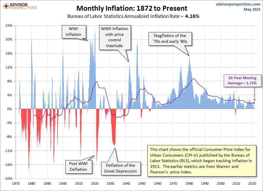
Monetary inflation and monetary disorder are what we face going forward. This spike in inflation is merely another nail in the coffin. The question is, how will it all end? Not well, we suspect. On the next page we are showing a long-term chart of inflation. Great chart. It shows well the inflationary spikes of WW1, WW2 and the 1970’s courtesy of Vietnam. It also shows the sharp deflationary periods of the early 1920’s, the Great Depression and a small deflationary period during the Great Recession.
Source: www.advisorperspectives.com
The Pandemic Rages On!
Could the actual count of the COVID pandemic be grossly understated? That is the premise of article from The Economist dated May 15, 2021. https://www.economist.com/briefing/2021/05/15/there-have-been-7m-13m-excess-deaths-worldwide-during-the-pandemic?utm_campaign=the-economist-today&utm_medium=newsletter&utm_source=salesforce-marketing-cloud&utm_term=2021-05-13&utm_content=article-link-1&etear=nl_today_1
While the rich world has suffered it is the developing world that is actually bearing the brunt of the pandemic. The Economist article premises that there has been an increase in daily estimated deaths globally above that, that would be considered normal within established confidence intervals. The premise is that there has been an additional 7 million – 13 million deaths during the pandemic. Instead of 3 million dead could the true figure be 10-15 million. That would also increase the number of cases to potentially 500-750 million cases worldwide. This is an upper end and it may not be the case at all. But the premise is interesting. In India they have estimated that they are most likely undercounted by a factor up to 30 times.
What it all says is that the numbers may be slowing in the rich world as people get vaccinated but in the developing world the numbers are still growing.
Sunday May 16, 2021 – 14:13 GMT
World
Number of cases: 163,261,106
Number of deaths: 3,385,567
Cases per million: 20,945
Deaths per million: 434.3
U.S.A.
Number of cases: 33,696,108
Number of deaths: 599,864
Cases per million: 101,284
Deaths per million: 1,803
Canada
Number of cases: 1,323,681
Number of deaths: 24,908
Cases per million: 34,806
Deaths per million: 655
Source: www.worldometers.info/coronavirus
Chart of the Week
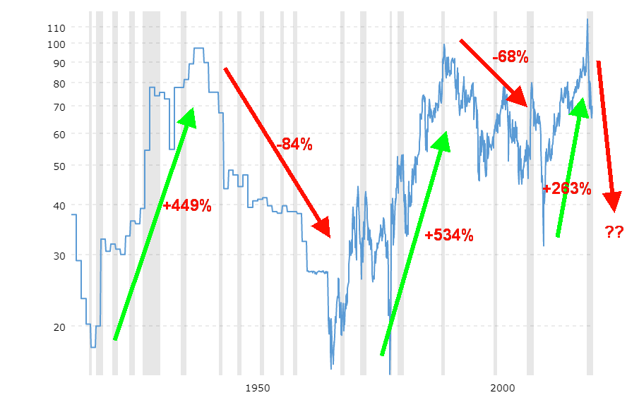
Gold/Silver Ratio 1915-Present
Source: www.macrotrends.net
The gold/silver ratio has a long history. But it is only in the last hundred years or so that we’ve witnessed huge swings in the ratio. The ratio shows the number of ounces of silver it takes to equal the value of one ounce of gold. It is the oldest continuously tracked exchange rate in history, dating back to ancient times.
The ratio of silver to gold in the earth is roughly 17.5:1. In ancient Rome they set the ratio officially as 12:1. That rarely varied for hundreds of years. The Venetians in 1305 set it at 14.2:1. It fell at one point by 1350 to around 9.4:1 but by 1450 or thereabouts it was back up to 12:1. With the Coinage Act of 1792, the newly constituted U.S. government fixed it at 15:1. For the next hundred years or so the ratio hovered around 15:1, but as financial problems grew along with manipulations in the late 19th century the ratio started to become more volatile.
Volatility set in during the early part of the 20th century, rising to 40.5:1 by 1915 but falling back to 18.4:1 by 1919. It really rose during the 1930s, especially after President Roosevelt set the price of gold at $35/ounce. It peaked in 1939/1940 at 98:1. Following Bretton Woods in 1944 the ratio began to decline again, falling to around 15.7:1 by 1968. With the end of the gold standard in August 1971 the ratio once again took off, peaking at 99.5:1 by 1991. That triggered a very irregular decline over the next 20 years where it bottomed again around 2011 at 31.6:1. The most recent climb started then and the most recent peak saw the gold/silver ratio hit a record peak at 114.8:1 in early 2020.
That has marked the top for now and another decline is currently underway with the gold/silver ratio having fallen to around 67:1. Based on history, the ratio could fall anywhere down to 18.4:1 to 36.7:1. Based on current prices of gold around $1,825 that could imply a price of silver as high as $100 to as low as $50. There are many out there who believe it could go even higher.
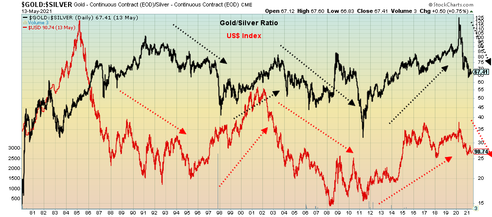
There are a few things we do note related to the gold/silver ratio. When the gold/silver ratio is rising, both gold and silver tend to be falling but silver falls faster. The reverse occurs when the ratio is falling: both gold and silver prices tend to be rising but silver is rising faster. The gold/silver ratio also tends to follow the US$ Index. When the gold/silver ratio is rising the US$ Index tends to be rising and, vice versa, when the gold/silver ratio is falling the US$ Index tends to be falling.
Gold/Silver Ratio vs. US$ Index
Source: www.stockcharts.com
We note that gold bottomed on March 16, 2020 at $1,450. Silver bottomed March 18, 2020 at $11.64. The US$ Index topped March 23, 2020 at 103.96. And finally, the gold/silver ratio topped March 18, 2020 with an intraday high of 131:4:1. Since then, gold is up 25.7%, silver has gained 134%, the US$ Index has fallen 12.8%, while the gold/silver ratio is down 49%. All of this implies that both gold and silver have further to rise with silver outpacing gold while the US$ Index has further to fall. These trends tend to stay in place for a number of years, although the ratio could be volatile during the downtrend with some sharp ups and downs.
Unfortunately, the odds of seeing the ratio used by the ancient Romans or in the early days of the U.S. government are probably about nil.
MARKETS AND TRENDS
|
|
|
|
% Gains (Losses) Trends
|
|||||
|
|
Close Dec 31/20 |
Close May 14/21 |
Week |
YTD |
Daily (Short Term) |
Weekly (Intermediate) |
Monthly (Long Term) |
|
|
Stock Market Indices |
|
|
|
|
|
|
|
|
|
S&P 500 |
3,756.07 |
4,173.85 (new highs) |
(1.4)% |
11.1% |
up |
up |
up |
|
|
Dow Jones Industrials |
30,606.48 |
34,382.13 (new highs) |
(1.1)% |
12.3% |
up |
up |
up |
|
|
Dow Jones Transports |
12,506.93 |
15,917.46 (new highs) |
(0.2)% |
27.3% |
up |
up |
up |
|
|
NASDAQ |
12,888.28 |
13,429.28 |
(2.3)% |
4.2% |
up |
up |
up |
|
|
S&P/TSX Composite |
17,433.36 |
19,366.69 (new highs) |
(0.5)% |
11.1% |
up |
up |
up |
|
|
S&P/TSX Venture (CDNX) |
875.36 |
931.38 |
(2.5)% |
6.4% |
down |
up |
up |
|
|
S&P 600 |
1,118.93 |
1,354.82 |
(1.4)% |
21.1% |
up |
up |
up |
|
|
MSCI World Index |
2,140.71 |
2,268.39 (new highs) |
34 |
6.0% |
neutral |
up |
up |
|
|
NYSE Bitcoin Index |
28,775.36 |
50,857.30 |
(11.0)% |
76.7% |
down |
up |
up |
|
|
|
|
|
|
|
|
|
|
|
|
Gold Mining Stock Indices |
|
|
|
|
|
|
|
|
|
Gold Bugs Index (HUI) |
299.64 |
306.56 |
1.6% |
2.3% |
up |
neutral |
up |
|
|
TSX Gold Index (TGD) |
315.29 |
322.22 |
1.9% |
2.2% |
up |
neutral |
up |
|
|
|
|
|
|
|
|
|
|
|
|
Fixed Income Yields/Spreads |
|
|
|
|
|
|
|
|
|
U.S. 10-Year Treasury Bond yield |
0.91 |
1.57% |
(3.7)% |
72.5% |
|
|
|
|
|
Cdn. 10-Year Bond CGB yield |
0.68 |
1.50% |
(3.2)% |
120.6% |
|
|
|
|
|
Recession Watch Spreads |
|
|
|
|
|
|
|
|
|
U.S. 2-year 10-year Treasury spread |
0.79 |
1.43% |
(2.7)% |
81.0% |
|
|
|
|
|
Cdn 2-year 10-year CGB spread |
0.48 |
1.20% |
(4.0)% |
150.0% |
|
|
|
|
|
|
|
|
|
|
|
|
|
|
|
Currencies |
|
|
|
|
|
|
|
|
|
US$ Index |
89.89 |
90.22 |
(1.2)% |
0.4% |
down |
down |
down |
|
|
Canadian $ |
0.7830 |
0.8260 (new highs) |
0.2% |
5.4% |
up |
up |
up |
|
|
Euro |
122.39 |
121.43 |
(0.2)% |
(0.8)% |
up |
up |
up |
|
|
Swiss Franc |
113.14 |
110.86 |
(0.2)% |
(2.0)% |
up |
neutral |
up |
|
|
British Pound |
136.72 |
140.95 |
0.6% |
3.1% |
up |
up |
up |
|
|
Japanese Yen |
96.87 |
91.45 |
(0.7)% |
(5.6)% |
down (weak) |
down |
down |
|
|
|
|
|
|
|
|
|
|
|
|
Precious Metals |
|
|
|
|
|
|
|
|
|
Gold |
1,895.10 |
1,838.10 |
0.4% |
(3.0)% |
up |
neutral |
up |
|
|
Silver |
26.41 |
27.36 |
(0.4)% |
3.6% |
up |
up |
up |
|
|
Platinum |
1,079.20 |
1,222.80 |
(2.5)% |
13.3% |
up |
up |
up |
|
|
|
|
|
|
|
|
|
|
|
|
Base Metals |
|
|
|
|
|
|
|
|
|
Palladium |
2,453.80 |
2,900.80 |
(1.0)% |
18.2% |
up |
up |
up |
|
|
Copper |
3.52 |
4.65 |
(2.1)% |
32.1% |
up |
up |
up |
|
|
|
|
|
|
|
|
|
|
|
|
Energy |
|
|
|
|
|
|
|
|
|
WTI Oil |
48.52 |
65.37 |
0.7% |
34.7% |
up |
up |
up |
|
|
Natural Gas |
2.54 |
2.96 |
flat |
16.5% |
up |
up |
up |
|
Source: www.stockcharts.com, David Chapman
Note: For an explanation of the trends, see the glossary at the end of this article.
New highs/lows refer to new 52-week highs/lows and in some cases all-time highs.
Source: www.stockcharts.com
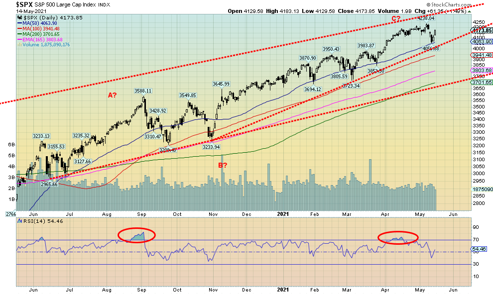
Once again, is the party over? We have had over the past several months a number of short-term sell signals that did result in a short-term pullback, but nothing long-lasting. Is this week another one? This past week indices once again made new all-time highs, then reversed and closed lower on the week. The S&P 500 lost 1.4%, the Dow Jones Industrials (DJI) dropped 1.1%, the Dow Jones Transportations (DJT) fell 0.2%. All made all-time highs before reversing. The NASDAQ diverged, nowhere near its all-time highs and fell the most, off 2.3%. The small cap S&P 600 also did not make new highs and was off 1.4%. In Canada, the TSX Composite made new highs and fell 0.5% while the TSX Venture Exchange (CDNX) dropped 2.5%.
In the EU, the London FTSE was off 1.4%, but the Paris CAC 40 made all-time highs and closed up 1.6% while the German DAX gained a small 0.1%. In Asia, China’s Shanghai Index (SSEC) was up 2.1% but the Tokyo Nikkei Dow (TKN) was down 4.3% and has broken down out of a descending triangle top as we noted in the “Scoop” last week.
Despite the reversal and drop this past week there is still no real sign that the market has topped. Even if, as we suspect, we have made a temporary top the expectation is that the drop should only be in the 10% range although some, such as the NASDAQ, appear poised to face a steeper drop. Worrisome for the S&P 500 is the appearance of what we believe is an ascending wedge triangle. It breaks under 4,000. The 50-day MA is at 4,064 and the 100-day MA is at 3,940. Hence, our look at the 4,000-support zone. The 200-day MA is down at 3,700 which would be a 12.7% drop from the high seen this past week. In September 2020 the S&P 500 dropped 10.6%, although at no time did the index test the 200-day MA even through to November before the final low was seen. There was a modest 6% decline seen in February 2021.
A drop to the 200-day MA would be more problematic as a major support line is seen near there. A significant drop under that level could set off a mini-panic.
Early indications are the May jobs report may not be so robust either. The U.S. is still short over 8 million jobs to recover to pre-pandemic levels. We remain concerned that the recent collapse of Argegos Capital was a warning shot that there could be more funds in trouble going forward. We compared the collapse of Argegos Capital and its subsequent loan losses at major banks as being somewhat akin to the collapse of the Bear Stearns hedge funds in sub-prime loans back in July 2007. The market did recover and went on to new highs in October 2007. However, in 2008 as the markets struggled to regain the highs, along came the Lehman Brothers collapse in September and a 50% plus collapse was underway.
The last major cycle was March 2009 and that, we believe, was the culmination of a 72-year, 36-year, and 18-year cycle low. So, the next 18-year cycle low is not due until 2024–2030. But the 18-year cycle can break down into three 6-year cycles or even two 9-year cycles. The last 6-year cycle probably bottomed in 2015–2016 while the 9-year cycle probably bottomed in March 2020, although arguably also December 2018. The March decline still fit into the 9-year cycle of 7 to 11 years. There is also a well-known 4-year cycle (range 3–5 years) although that has seemed off of late. There was a low in 2011 which seemed early, then the lows in 2015–2016 and the low in 2018 and 2020. The next 6-year low is due in 2022 range 5–7 years: therefore 2021–2023. The 2020 low seemed too soon to be the 6-year low. Irrespective of this, these lows are often sharp but brief.
Our best call right now is a pullback, then another runup that could once again see new all-time highs, then a roll-over into the latter part of the year, and a low in 2022. Inflation is rising and should continue to rise for the foreseeable future at least but many see it as transitory. Nonetheless, we don’t expect the Fed to react negatively unless it continues to post 3% + for the core inflation rate. Large distribution patterns take sometime to form. The 2007-2008 distribution pattern for the S&P 500 played out over roughly 11 months from July 2007 (the first top) to May 2008 (the final top). After May the collapse got under way with the breakdown starting in June 2008 as the S&P 500 plunged under the 200-day MA.
Source: www.stockcharts.com
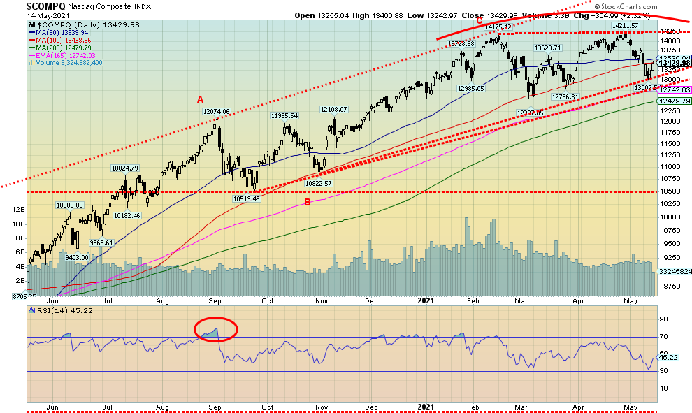
The NASDAQ continues to diverge from the other major indices. This past week the NASDAQ fell 2.3%, the worst of any of the major indices. The high-tech stocks that led the NASDAQ to new heights continued to fall. The list is lengthy and consistent. Facebook -1.0%, Apple -2.1%, Amazon (which see below) -2.1%, Netflix -2.1%, Google -3.5%, Microsoft -1.7%, Tesla (the biggest loser) -12.3%, Twitter -3.9%, Baidu -2.8%, Alibaba -7.0%, and Nvidia -3.8%. Oh, and Berkshire Hathaway (ultimate value stock) was flat on the week after making new all-time highs again. Despite the minor, slightly higher high seen on the NASDAQ on April 29 the NASDAQ still appears to be making a potential double top. On April 29 the all-time high was followed by a reversal and lower close. The NASDAQ is now down three weeks in a row and appears to be headed lower. If it is truly a double top, then the first real breakdown comes under 13,000 and under 12,800 a more serious breakdown could get underway. If a potential double top is correct, then the potential target is down to 11,000/11,200, a decline of 22.5% from the April high. Only new highs above 14,211 could change the negative scenario. Although, arguably, a move back above 13,750 would be an encouraging sign that new highs could be seen.
Source: www.longtermtrends.net
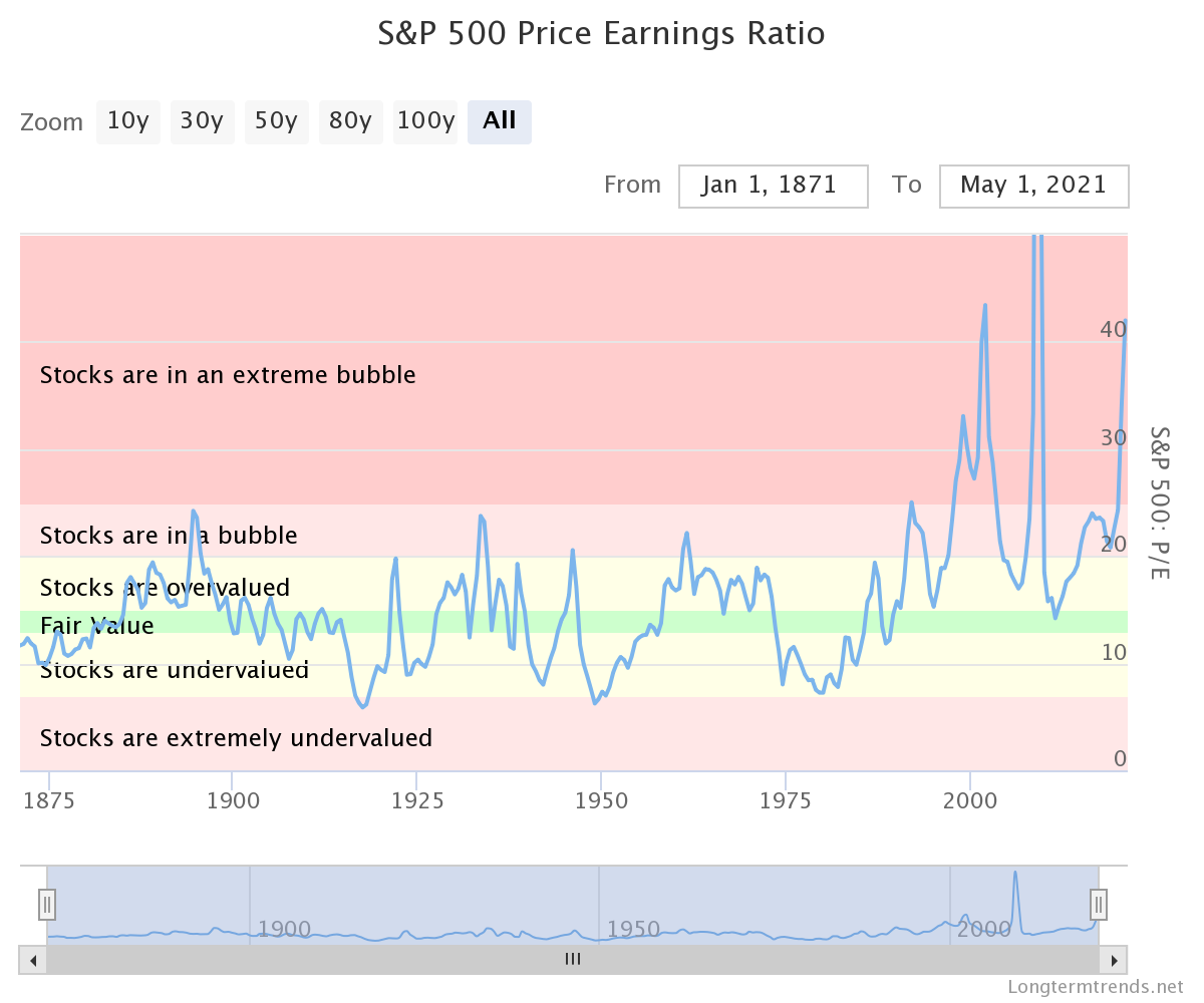
The price earnings ratio (PE) is calculated by dividing a company's stock price by its earnings per share. In other words, the price earnings ratio shows what the market is willing to pay for a stock based on its current earnings. It is one of the most widely-used valuation metrics for stocks. For years the PE ratio fluctuated in a range between 6 and 25. Then in the late 1990s something strange happened. The PE ratio broke out into what some term as bubble territory. It peaked near 46 in 2002. By 2006 it came back down to a more reasonable range near 17 as the dot.com bubble was followed by the dot.com bust. Then it started rising again, and rising, and rising and…by 2009 it was off the charts as earnings effectively fell to zero. By December 2011 it was once again down in a more reasonable range near 14. But the effects of all the monetary easing kicked in and the ratio has been rising, and rising again. Now it is back up over 43. If the history tells us anything, we expect once this breaks we’ll witness another monumental collapse to bring the PE ratio more in line with its historical mean and fair value once again. This PE ratio is different than the Case Shiller PE in that this only measures reported earnings of the previous 12 months vs. the Case Shiller PE measures inflation adjusted earnings of the previous 10 years. However, even by that measurement, stocks are in a bubble or, as the chart says, an extreme bubble.
Source: www.longtermtrends.net
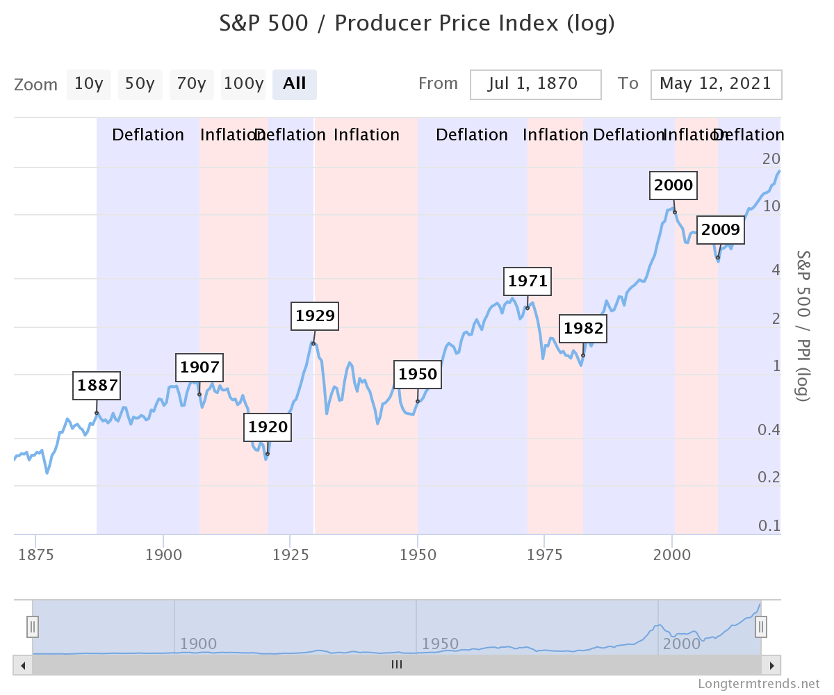
The stocks to commodities ratio measures the S&P 500 relative to the commodity market index PPI (Producer Price Index). When the ratio rises, stocks beat commodity returns—and when it falls, commodities beat stock returns. The chart above terms in periods of inflation and deflation. During inflationary periods commodities outperform (1907–1920, 1929–1950, 1971–1982, and 2000–2009). During deflationary periods stocks outperform (1887–1907, 1920-1929, 1950-1971, 1982-2000, and 2009–present). If we are truly entering an inflationary period, then the expectation is over the next number of years we could see commodities outperform stocks.
Source: www.stockcharts.com
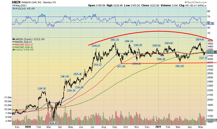
If we want to be a bear on the market, the pattern on Amazon appears to us as one big topping pattern. Multiple attempts at new highs just keep failing. We even made a tiny new high at 3,554 but then it failed again. We are now trading under the 200-day MA and appear poised to break lower. The major line is at 2,900. A breakdown under that level could in theory send AMZN tumbling down to 2,200, a decline of 38% from the all-time high. Beware. This is not a bullish pattern. It spells trouble. Topping patterns and even downtrends are now present on all the FAANGs and those in the FANG Index.
Source: www.stockcharts.com
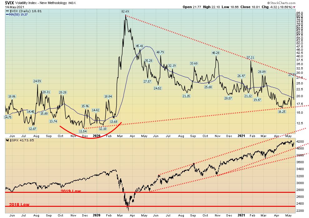
Temporarily, at least, volatility spiked this past week but once the Fed soothed ruffled feathers the VIX promptly fell again. The VIX Volatility Indicator does move inversely to the S&P 500. By the week’s end it was back under 20. The VIX failed just under the downtrend line from the March 2020 top. So, to end the downtrend it would take a move over 27.50 and preferably over 30 to confirm that a low (top in the stock markets) is in. Support is seen down to 17.5.
Source: www.stockcharts.com
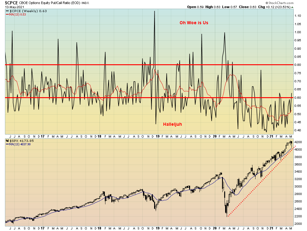
While the CBOE put/call ratio did return back over 0.60 this past week it is still low historically. The inflation numbers earlier in the week sparked more put buying. We have now returned, momentarily at least, to the neutral zone although it remains near the super-bullish zone.
Source: www.stockcharts.com
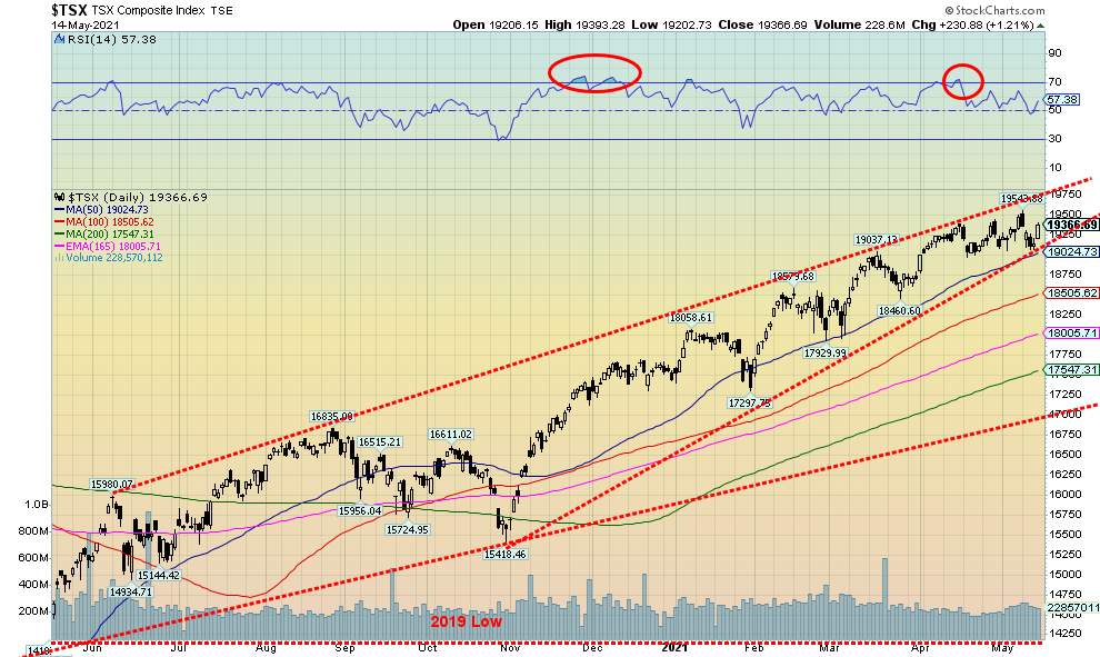
New highs, a reversal, and a lower close usually spell trouble. However, we have seen this happen before and each time the markets rebounded to new highs. Still, new highs near the top of the channel could signal at least a temporary top. The TSX Composite saw the new high then closed lower on the week, down 0.5%. The TSX Venture Exchange (CDNX) didn’t fare as well, losing 2.5% on the week as profit-taking dominated the juniors that dominate the CDNX.
Only four of the 14 TSX sub-indices saw gains on the week. It was led by Golds (TGD), up 1.8%. Consumer Staples (TCS) was up 1.4%, Financials made new 52-week highs and closed higher by 1.4%, while Telecommunications (TTS) was up a small 0.2%. Leading the losers was Health Care (THC), down 6.0%. Metals & Mining (TGM) made new 52-week highs and then reversed, closing down 2.1%. Information Technology (TTK) was the other big loser, down 3.1%.
The 19,000 zone remains key for the TSX Composite. A breakdown under that level could spell trouble and a potential decline to 18,500, even a big drop to 17,300. The TSX like other stock indices may have made important highs this past week. Still, at this point we don’t see a big drop in the indices just yet. A drop to the 200-day MA near 17,500 is only about a 10% decline and would not be out of place. The big line in the sand is 17,000 where a breakdown under that level could spark a panic. The TSX did experience an 8.5% decline last September to November. So, we don’t see a 10% decline as too big of a deal. After that, a return to new highs remains possible.
Source: www.stockcharts.com
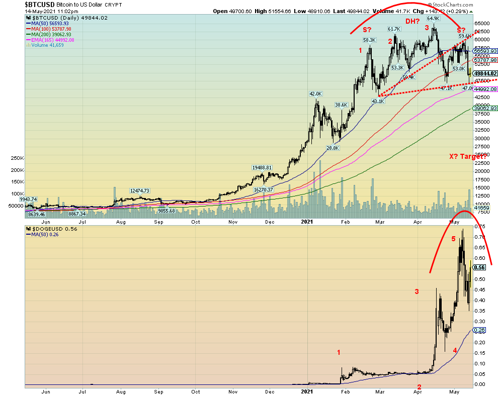
Have the cryptocurrencies topped? This past week the NYSE Bitcoin Index fell 11.0%. Bitcoin as at time of writing was down 17.2% on the week and our friend Dogecoin was down 11.6% on the week. For Bitcoin we are looking at a possible topping pattern—a double top head and shoulders pattern. The breakdown level is around $47,000 and projects down to around $25,000. A move back above $60,000 could kill the pattern and also suggest that new highs above $65,000 were possible. Dogecoin is not as clear for a top but spike tops are not unusual and Dogecoin appears to have completed 5 waves up from January. Dogecoin is quite volatile and is being made more so following comments from Elon Musk of Tesla fame. The patterns are not friendly and those holding cryptos with big profits might consider taking some. A breakdown in the crypto market could also spell trouble for the stock market.
U.S. 10-year Treasury Bond/Canadian 10-year Government Bond (CGB)
Source: www.tradingeconomics.com, www.home.treasury.gov, www.bankofcanada.ca
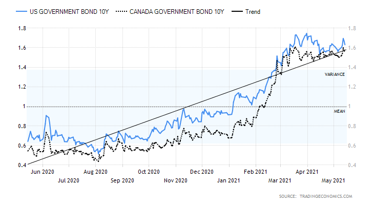
Have bond yields topped? This week, despite the higher than expected inflation numbers, the much weaker than expected retail sales numbers, coupled with soothing words from the Fed on inflation helped push yields down again. Still, the U.S. 10-year treasury note yield did rise to 1.63% on the week, up 6 bp but that’s off the high of the week at 1.70%. The high was 1.75% on March 31. Could we be seeing a double top? If so, the breakdown is under 1.53% with a target down to 1.30%. The Canadian Government 10-year bond yield rose to 1.56%, also up 6 bp on the week. The big economic numbers day was the CPI that showed the CPI up 0.8% in April while the core inflation rate (ex food and energy) jumped 0.9%. That left them up year-over-year by 4.2% and 3.0% respectively. At 3% core inflation, the rate is above the Fed’s target of 2% and above its upper limit of 2.5%. Then on Thursday it was the PPI which was up for April by 0.6% while the core PPI was up 0.7%. Year-over-year, the PPI was up 6.2% and the core PPI was up 4.1%. The markets were “flipping” with bond yields rising and the US$ Index rising and gold falling.
But then came Friday and the retail sales were a major disappointment, coming in flat vs. an expectation of a gain of 1%. Year-over-year retail sales were up 51.2% but don’t forget that was from the disastrous hole of April 2020. Ex autos retail sales were down 0.8% in April vs. an expectation of a gain of 0.7%. Then came in industrial production for April that was up 0.7% but the market expected a gain of 1% and the previous month it was up 2.4%. Year-over-year IP was up 16.2% but the market had expected a gain of 19%. Again, that was out of the disastrous hole of April 2020 so the number is distorted somewhat.
The Michigan Consumer Sentiment Index came in at 82.8 (preliminary) vs. an expectation of 90.4. Earlier in the week the JOLTS job openings survey showed 8.123 million openings vs. an expectation of 7.5 million. Higher numbers may be reflecting mismatches rather than people saying they don’t want to work because the benefits are too good. As well most benefits run out by August. Those offering decent wages are getting filled. The weekly initial jobless claims came in at 473,000, below the expected 490,000 and last week’s 507,000—still high but coming down.
We are wondering whether we have hit a ceiling on bond yields. The high of 1.74% was seen on March 31 and since then we have been in a drift downwards. But we have yet to break down so we can’t confirm any top. A break under 1.40% would confirm a top. However, to do that we’d probably need to see more disappointing economic numbers. The Fed helped ease things with soothing words on inflation. And many economists believe the inflation rise is temporary or transitory. New highs above 1.75% would suggest to us that we are on a new upward run that could still take us to potential highs near 2.00%. Not a lot of numbers this coming week. Some manufacturing numbers along with housing starts and sales. Canada does report CPI and retail sales this coming week. https://tradingeconomics.com/calendar
Source: www.stockcharts.com
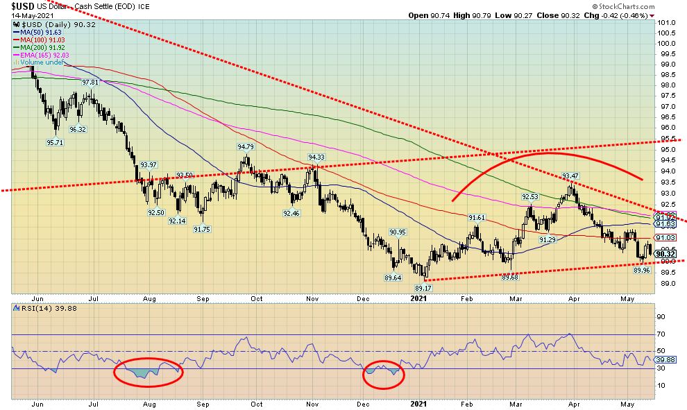
Is the US$ Index poised to break down? The higher-than-expected inflation numbers, coupled with rising bond yields and some encouraging economic numbers, helped push the US$ Index earlier in the week. However, the weaker than expected retail sales numbers on Friday along with soothing words on inflation from the Fed pushed the US$ Index right back down again by the end of the week. Arguably, we could say a top is in and even that the US$ Index is potentially making a head and shoulders top pattern, although admittedly the shoulders are pretty feeble. Still, if it is a breakdown, under 90.00 once again could target the US$ Index down to 85/86.
This past week the US$ Index gained a small 0.1%. The euro fell 0.2%, the Swiss franc was off 0.2%, the Japanese yen was hit down 0.7%, while the pound sterling was up 0.6%. The Canadian$ hit a fresh 52-week high at 83.02, then reversed and closed lower at 82.60 but was still up 0.2% on the week. That leaves thoughts that the Canadian$ could go even higher still towards 84 and 85. Fair value for the Cdn$ is considered to be around 80. It is not unusual for the Cdn$ to go through periods of undervaluation and overvaluation vis-à-vis the US$.
As noted, the key for the US$ Index is a breakdown under 90. However, until that happens the US$ Index could still recover and head back up towards 91/91.50. We note major resistance up at 92. A breakout over 92 would turn the US$ Index bullish.
Rest of the page is blank
Source: www.stockcharts.com
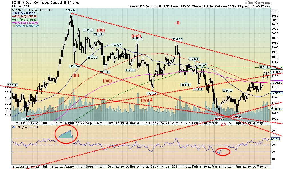
For the second consecutive week gold rose, gaining 0.4%. However, gold remains down on the year, off 3.0%. Silver was down a small 0.4% but is up on the year by 3.6%. Platinum fell 2.5% but is up 13.3% in 2021. Of the near precious metals that are industrial metals, palladium was off 1.0% on the week but remains up 18.2% on the year. Copper remains the star but slipped from its high, off 2.1% on the week but up 32.1% on the year.
Gold was beaten down earlier in the week with the high CPI numbers that helped push up the U.S. dollar and bond yields. Lower than expected initial weekly claims also helped to weaken gold. But the Fed easing thoughts on inflation along with the much weaker than expected retail sales numbers steadied the bond yields while the U.S. dollar fell. That rallied gold and the gold stocks. As long as the Fed remains dovish despite rising inflation that is likely to help gold going forward. Stronger economic numbers along with rising inflation could help push up the U.S. dollar and hurt gold.
Despite all of that, gold is now approaching its most key make-or-break level since making its last bottom at $1,673 in March. The entire zone between $1,850 and $1,900 is a make-or-break zone. Make because a firm close over $1,880/$1,900 would confirm to us that we could make a move towards the August high of $2,089, whereas failure up to $1,860 would refocus us to the downside. A break back under $1,795 would be negative and a break under $1,755 would be fatal. Even if we confirm a break over $1,900, we need to close above $1,990 to confirm to us that we could make new highs. Helpful this past week is what appears to be a breakout on the gold stock indices. Both the Gold Bugs Index (HUI) up 1.6% on the week, and the TSX Gold Index (TGD) up 1.9% on the week appear to be breaking above their downtrend line from the August 2020 top.
Gold remains down 12% from the August 2020 top. At the $1,673 low gold was down 20%. We continue to believe that the March $1,673 low was our 31.3-month cycle low and we should now be entering our third and final phase of the 7.83-year cycle. The third and final phase can either be bearish, meaning it fails to make new highs and then crashes or it soars into a blow-off mode. The 7.83-year cycle low would also coincide with the 23–25-year cycle low that dates from 1999/2001, although that wide cycle centered on 2024 could come in anywhere from 2019–2028. The key area seems to be 2023/2024, based on the last 7.83-year cycle seen in December 2015. That gives us hope that this third and final phase of the 7.83 cycle will be a blow-off that could take gold to potential targets up at $2,200 to $2,500. However, we need confirmation and that will only come first on a firm breakout over $1,880/$1,900 and second on a confirmed breakout over $1,990/$2,000. In other words, these are our make-or-break points. Despite the rise from the March low none of gold, silver, or the gold stocks have reached overbought territory yet and the bullish consensus is not yet into the stratosphere around 90% that is more typical of a top. For those reasons we remain positive. But caution that the U.S. dollar, bond yields, and the economy also remain important if gold is to go higher or to break down.
Source: www.cotpricecharts.com
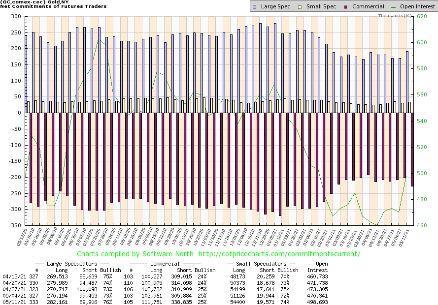
The gold commercial COT (bullion companies and banks) was unchanged this past week at 25%. We admit not being comfortable with it being that low as it remains in bearish territory. Still, there was a big jump of almost 8,000 contracts in long open interest and an even bigger jump in short open interest, up roughly 33,000 contracts. The large speculators COT (hedge funds, managed futures, etc.) jumped to 76% from 73% as they added roughly 12,000 contracts to long open interest and dropped almost 10,000 contracts from short open interest. Total open interest rose over 28,000 contracts on the week that gold was up.
Source: www.stockcharts.com
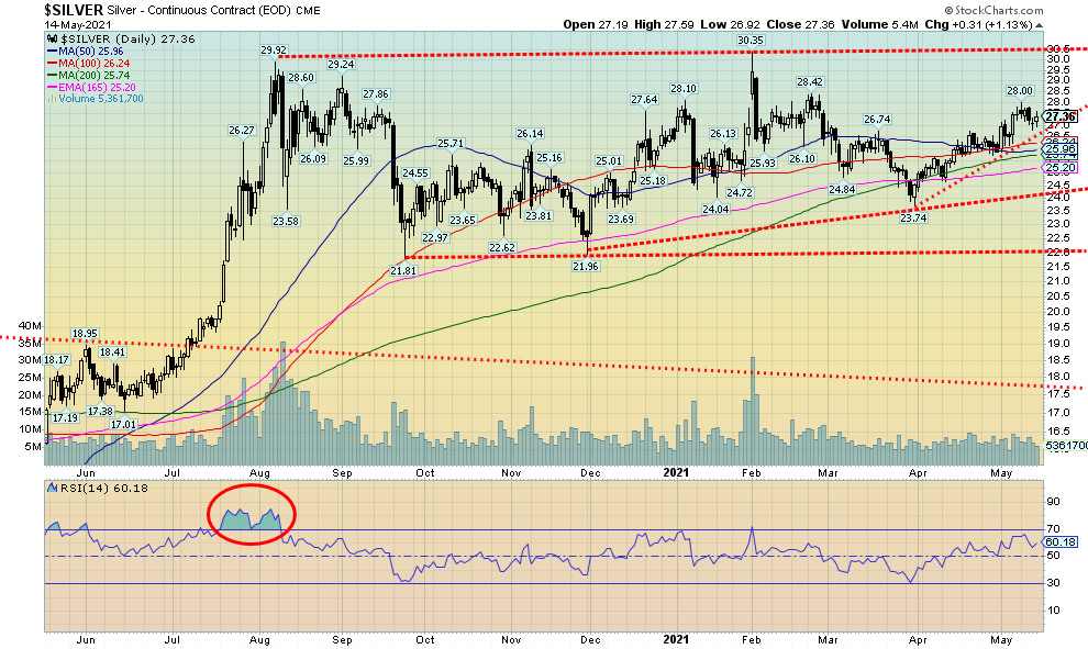
Silver never quite overcame early weakness and closed the week down a small 0.4%. Like gold, the U.S. dollar and bond yields need to remain friendly for gold and silver to rise. With gold up on the week our preference would have been to see silver outperform. So that is a bit of a concern as we go into this week. Silver bears are still repeating the mantra that silver is nearing the end of its move here that could see silver give us a false breakout above $28. While we view a breakout above $28 positively (it hit that level May 10 but then faded) we would need to see a breakout above $28.80 to confirm that we could be headed for new highs above $30.35 the February 1 high. To the downside, if silver were to fall and break back under $25.75, we would view that negatively and suggest that a top is in. We remain buoyed by the relatively flat top (highs of $29.92 and $30.35) that some view as a double top and the more recent rising lows following the low seen on November 30 at $21.96. So, pick it. Is it a double top, or an ascending triangle? The bears pick the top while the bulls cite the triangle. Ergo, await and keep in mind $28.80 to break out or $25.75 to break down. The breakout could target up to $39/$40 while a breakdown, especially under $24, could suggest new lows below $21.80. Fundamentals seem to favour the bulls but our key is that the U.S. dollar continue its downward descent and bond yields at least remain flat to down.
Source: www.cotpricecharts.com
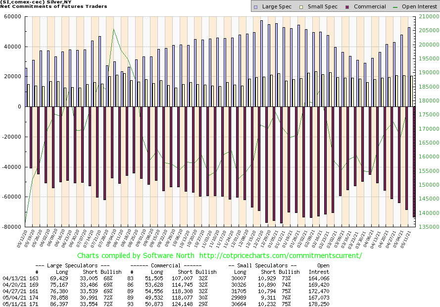
The silver commercial COT slipped this past week to 29% from 30%. Long open interest was up just over 1,000 contracts but short open interest rose over 6,000 contracts. For the large speculators they were unchanged at 72%, although their long open interest position rose almost 8,000 contracts while their short open interest position also jumped by almost 3,000 contracts. We have to view this week’s drop as mildly bearish going forward and will need to keep an eye on it. Total open interest rose on the week by over 11,000 contracts.
Source: www.stockcharts.com
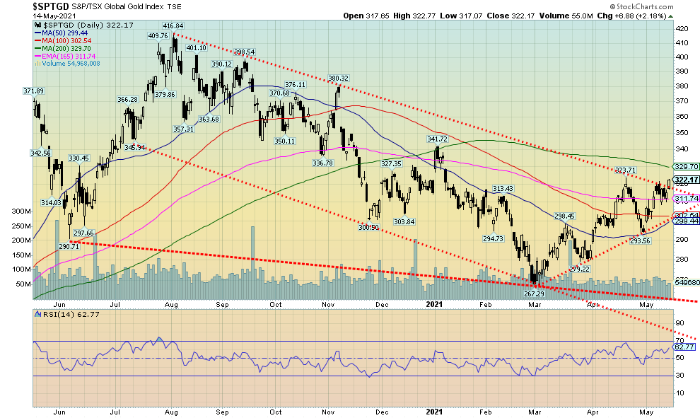
Are the gold stocks breaking out? This past week the TSX Gold Index (TGD) broke above its downtrend line from the August top. The breakout is not yet confirmed and we’d feel more comfortable on consecutive closes over 330. The TGD closed higher for the second consecutive week with a gain of 1.9% leaving the TGD up 2.2% now on the year. The Gold Bugs Index (HUI) was also up gaining 1.6% and is up 2.3% on the year. Both indices have spent most of the year in the red so this return to the black is most welcome. Ahead for the TGD is the April high of 323.71. Above that level the TGD should make its run to 329/330 resistance. Above 330 our comfort level rises. To the downside, the late April low at 294 is now our key resistance. A breakdown under that level would suggest that a top is in. Despite the rise this past week and a return to gains on the year the TGD remains down about 23% from its August 2020 high. Yes, the TGD (and HUI) had both entered bear markets in November 2020 and they have yet to confirm the end of the bear, although technically we are now up just over 20% from the March low of 267. We’ll continue to focus on 330 to officially end the bear move. Gold stocks remain quite undervalued when compared to gold. The Gold/HUI ratio is currently 6.00, a long way from under 2.5 that would signal that gold stocks are overvalued compared to gold. A firm breakdown under 5.5 would at least bring the gold stocks back into fair value with gold. The most recent lows were seen in July 2016 at 4.77 and again in August 2020 at 5.31. The peak was at 10.15 back in September 2015 with the most recent peak at 9.76 seen during the March 2020 pandemic panic.
Source: www.stockcharts.com
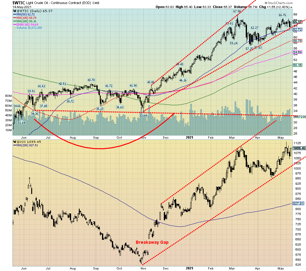
A midweek sell-off for oil was followed by a rebound on Friday after inflation fears faded. The global supply glut is fading, just in time for the IEA to revise its demand projections downward. WTI oil gained 0.7% this past week. The energy stocks didn’t bite and they sold off during the week as the ARCA Oil & Gas Index (XOI) lost 0.5% while the TSX Energy Index (TEN) slipped by 0.7%. Natural gas (NG) was unchanged on the week.
Not a lot to say here as both the WTI oil and the XOI remain in their respective bull channels. WTI oil is closer to a breakdown. A break under $62.70 could send oil to $60 or $58. Grant you, WTI oil has been climbing the 50-day MA steadily here since March, unable to reach higher but not breaking down either. Kind of a creepy-crawly rise. The XOI spiked upward and has since settled back a little, although it rallied Friday following easing of inflation fears and oil rising $1.55 on the day.
The IEA reported that the supply glut that grew during the pandemic has eased because of OPEC production cuts and lower demand. The IEA revised its 2021 forecast downward by 270,000 bpd largely due to lower consumption levels in Europe, OECD Americas, and India.
The big story of the week was the shutdown of the Colonial pipeline because of a ransomware attack that resulted in gasoline shortages at the pumps for millions along the southeast coast of the U.S. While Colonial paid a ransom, the fix isn’t working well and the lineups and shortages have persisted. Enbridge continued to run Line 5 despite threats to shut it down. It is all before the courts. The Canadian government is now involved as well, but the response from the U.S. Federal government is tepid at best. The main battle is with the state government of Michigan.
We could argue that WTI oil is forming some sort of top here. A breakdown under $59/$60 would confirm a top is in. Only new highs above $67 would now convince we are headed higher. The XOI is also starting to look toppy, especially that spike high on Monday that saw the XOI make new 52-week highs, only to reverse and close lower. The XOI breaks down under 1,025. The TEN also saw a fresh 52-week high this past and its action was similar to the XOI. A reversal and lower close on May 10. The TEN’s first break is under 122, then under 119.50. A major breakdown could occur under 112.50 targeting down to 90/91.
Technically, both oil and the oil stocks look vulnerable here.
|
Charts and commentary by David Chapman Chief Strategist, Enriched Investing Inc. Phone: 416-523-5454 Email: david@davidchapman.com dchapman@enrichedinvesting.com Twitter: @Davcha12 May 17, 2021 |
Copyright David Chapman, 2021
Disclaimer
|
GLOSSARY Trends Daily – Short-term trend (For swing traders) Weekly – Intermediate-term trend (For long-term trend followers) Monthly – Long-term secular trend (For long-term trend followers) Up – The trend is up. Down – The trend is down Neutral – Indicators are mostly neutral. A trend change might be in the offing. Weak – The trend is still up or down but it is weakening. It is also a sign that the trend might change. Topping – Indicators are suggesting that while the trend remains up there are considerable signs that suggest that the market is topping. Bottoming – Indicators are suggesting that while the trend is down there are considerable signs that suggest that the market is bottoming. |
David Chapman is not a registered advisory service and is not an exempt market dealer (EMD) nor a licensed financial advisor. We do not and cannot give individualised market advice. David Chapman has worked in the financial industry for over 40 years including large financial corporations, banks, and investment dealers. The information in this newsletter is intended only for informational and educational purposes. It should not be considered a solicitation of an offer or sale of any security. Every effort is made to provide accurate and complete information. However, we cannot guarantee that there will be no errors. We make no claims, promises or guarantees about the accuracy, completeness, or adequacy of the contents of this commentary and expressly disclaim liability for errors and omissions in the contents of this commentary. David Chapman will always use his best efforts to ensure the accuracy and timeliness of all information. The reader assumes all risk when trading in securities and David Chapman advises consulting a licensed professional financial advisor before proceeding with any trade or idea presented in this newsletter. David Chapman may own shares in companies mentioned in this newsletter. We share our ideas and opinions for informational and educational purposes only and expect the reader to perform due diligence before considering a position in any security. That includes consulting with your own licensed professional financial advisor.


